NBC’s catchphrase gave me a chuckle, not the least bearing in mind that the Peacock logo was originally intended to promote the “new” color programming available back in 1956. This title appears at the end of a Law and Order promo that I saw on Vimeo (thanks to Graeme Nattress for pointing it out on Twitter).
First, I just want to get the fact that it was shot using the RED Epic out of the way. Yes, the Epic is a new and wonderful camera, and yes, it captures fantastic images with lots of latitude for grading etcetera etcetera and so on…
That’s not what I want to talk about.
What I want to talk about are the decisions that the DP (Rhet Bear) and colorist (I don’t know who) made while crafting the look of this piece. As with many promos, a bold look was created, but there are a lot of elements at play that immediately struck me as a good opportunity for discussion.
So, watch the video, and then read on.
It’s a very nice promo, visually interesting, with great lighting and effective grading, which is what I’d like to talk about. Now, as is typical for a visually beautiful piece, it’s difficult to know where the DP’s work ends and the Colorist’s work begins, so I’m just going to discuss the look of the piece as a whole. If by some happy coincidence the original DP and/or Colorist stumbles across this post and wants to comment, I’d be very happy to learn more.
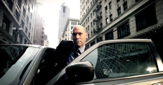
Let’s take a look at an early frame, medium on the actor with a wide expanse of background.
There are some bright, soft highlights going on here, both in the blown-out background, and a hard rim light on the man’s face. I dig it, and in fact I’ve never been one to be afraid of softly blown-out highlights (for the right situation). However, the key word is softly.
Battlestar Galactica (the new series that is) also indulged in hot, blown-out highlights, but again, the overexposure was a smooth “blooming” effect, rather then the harsh digitally aliased crap that you end up with if you simply overexpose a digital signal. When you overexpose film, light bounces among the different emulsion layers and causes halation, which lends a soft blurry glow to blown-out highlights that can look quite nice (who doesn’t like a bit of glow). This is the quality we associate with “good” overexposure.
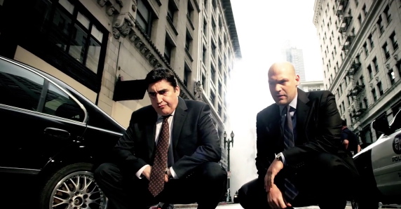
Another aspect of this shot that we can also see in the following shot is the willingness to allow a bit of overexposure on the face. Granted, this is a bit inevitable due to the shininess of a bald scalp, but still, since it’s motivated by an already high contrast ratio, and since the majority of the face is still well-exposed, letting a bit of rim light or forehead shine blow out won’t kill anyone.
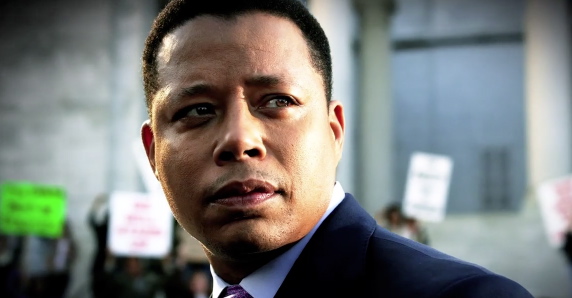
I don’t know how many times I’m asked to do something to “patch up” a bit of overexposure on the face, when a) it may not be necessary since it looks just fine, and b) the fix can sometimes end up looking worse then the original bit of overexposure. Here’s another shot with high-contrast light on the face and bright highlights.
Even though the actor’s complexion is clearly darker, the highlight on his cheek is really quite hot, but that’s okay, because the lighting in the shot justifies it (more or less, it’s a promo after all), and there’s still plenty of detail in the midtones and shadows of the actor’s face. Now, I’m not saying this is how you should always grade faces, I’m just saying there are times when strong face highlights are perfectly fine.
The key is to make sure that the edges of the blown out areas roll off smoothly and softly into the rest of the midtones, which depends on two things. First, the original shot needed to have been exposed carefully so that the bright highlights aren’t clipped, because that will make the job ten times harder or virtually impossible (RED footage seems to have a softer knee at the highlights then lower-end digital camcorders, so that helps).
Second, you need to control your overexposure adjustments so that YOU don’t end up introducing harsh clipping. Granted, you’re going to need to push your highlights up beyond 100 percent to get the blowout, but you need to make sure that you compress the highlights as you do so, rather then simply clipping them past 100. There are a few ways you can do this.
- You can roll off the top of your YRGB curves (if you have them) so that the very top end of exposure is squeezed before clipping, which will give you some softness.
- You can use something like DaVinci Resolve’s Soft Clipping controls to compress the clipping at the highlights.
- You can selectively blow out the highlights by using HSL Qualification to isolate the top highlights, blur out the resulting matte, and push the entire keyed region up to, but not beyond, 100 percent to simulate a soft roll-off.
Another interesting thing about these shots is the selective use of saturation. Skin tones retain a fairly high degree of saturation, while the background saturation is a bit muted. This has the function of drawing our eye straight to the actors (the folks they want us to be looking at). However, the following shot shows another interesting use of selective saturation.
Yes, the actor’s face still has visibly higher saturation then the surroundings, but there’s also a fair amount of color ringing the light hitting the brick wall in the background (and it’s even an analogous color, no orange/teal going on here). Even though the overall image has fairly subdued saturation, the existence of an additional pool of color that’s of a distinctly different hue then the flesh color of the the man’s face increases the perceived colorfulness of the image, while keeping the viewer’s eye on what we want them to be looking at via the stark color contrast between the face and the rest of the scene. (If you’re wondering what colorfulness and color contrast are, there are a few sections in my book that explain)
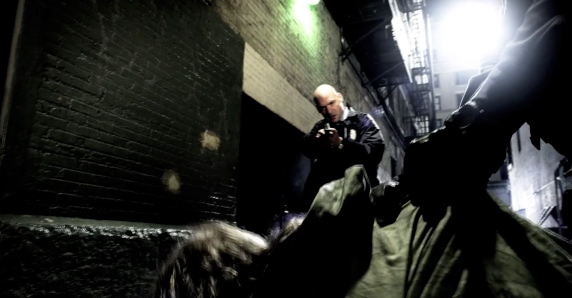
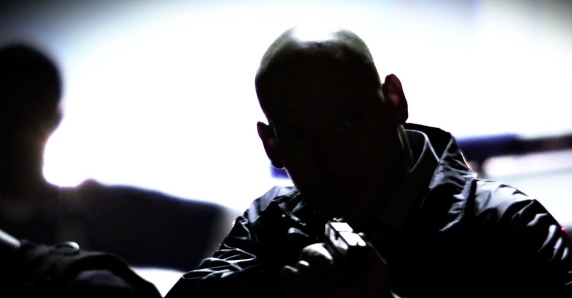
Here’s another fun thing, and this I suspect was a bit of serendipity that the colorist was able to capitalize on. The alley scene has a lot of silhouette. Stark, striking, I love this kind of thing.
However, it can be tempting for clients to wimp out and say “I wish we could see the guys’s face a little.” Well, check out a few frames later.
Some flaring from the police car lights wraps around his face, providing a great excuse to see a bit of facial detail every other second. By carefully adjusting those blown-out highlights, we’re able to have both the stark silhouette, and short glimpses of the character’s tense expression.
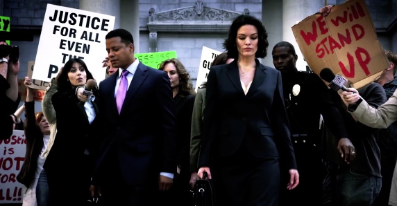
Let’s take a look at one more shot; this time a wider, more colorful image.
There are a few things going on here. For one, we can clearly see the upper left/right corner vignette that’s been applied throughout the spot to give a bit of style, and focus our eyes towards the center of the image. Also, here we can see a lot more color, but what I want to point out in particular is the role that the costume department has played.
The clothes of the main players are all dark and muted (except for the purple tie). This choice of attire makes it easier to pull a high contrast look, easier to have the faces stand out amongst a pool of neutrality, and easier for the red and green of the background signage to stand out (although I suspect there was more then a bit of HSL qualification used to tune the tie and sign colors to be just right).
Beginning directors and cinematographers should never underestimate the impact that art department decisions will have on the final image. Sure, we colorists have all kinds of tools and toys for selectively playing around with individual colors in the frame, but a) color needs to be there to begin with, and b) it’s a lot faster to choose dark suits during a wardrobe meeting then it is to have a colorist rotoscope the actors in a shot to try and selectively make beige suits dark blue if you change your mind later.
Disclaimer—No, I don’t have permission to reproduce any of these images, so hopefully NBC’s lawyers don’t throw me into the pokey. Hopefully, as I’m saying nice things and, frankly, promoting their show, they’ll cut me some slack. And once again, my complements to the Cinematographer and Colorist who worked on this. Very pretty indeed.


1 comment
Nice! I like the good overexposure sometimes too, when the occasion calls for it.
“Beginning directors and cinematographers should never underestimate the impact that art department decisions will have on the final image. Sure, we colorists have all kinds of tools and toys for selectively playing around with individual colors in the frame, but a) color needs to be there to begin with, and b) it’s a lot faster to choose dark suits during a wardrobe meeting then it is to have a colorist rotoscope the actors in a shot to try and selectively make beige suits dark blue if you change your mind later.”
I agree! It’s the “we’ll fix it in post” thinking. I really don’t like it when they ask you to shift colors so far from what they really are. And yes, it eats up a lot of everyone’s time when you need to rotoscope it too. They would have saved a lot of money if they just changed that item before they shot it.