It’s an old saw that if you want to write, you should read as much as you can. Every piece of work you consume adds to your mental inventory of artistic possibility, and it’s as true for image-makers as it is for writers. If you want to create memorable visuals, you owe it to yourself to see what others have done before you.
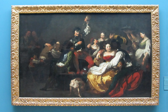
In my various travels, I always try to squeeze in a trip to a gallery or two; no matter how good a print or digital reproduction is, it will never equal reflected light off an original canvas. The last time I was in Nürnberg, Germany, I squeezed in a trip to the very excellent Germanisches Nationalmuseum, which has what has become one of my favorite paintings, Johann Liss’ 1623 “The Prodigal Son With the Prostitutes.” (Image thanks to TimSpfd at flickr)
It delights me no end that most of the techniques we seek to employ when shooting and grading cinematic images were pioneered and mastered centuries earlier by generation after generation of painters, sculptors, and fabric and glass artists. It’s staggeringly instructive to notice particular techniques made in completely different media that have direct application in your own work.
In the painting above, note the startlingly careful control of multiple planes of highlights. Not only is the overall image brilliantly high-contrast (although the photo diminishes this somewhat, in person the contrast is deep), but the highlights on each plane of subjects fall at progressively diminishing levels relative each figure’s distance from the camera. This control of highlight creates depth by keeping the most brilliant and crisp highlights on the couple nearest the viewer, while the highlights of figures farther away (the servers, couples in the background) are more muted. The one exception is the prodigal son himself, at the center of the room and thus behind the front-most couple; his cuff and sleeve are rendered with brilliant, sparkling highlights equal to those of the foreground characters, thus keeping him at the forefront of the viewer’s attention.
Negative space is utilized naturalistically by leaving the background to fall to shadow, with the exception of a few subtle details to keep the surrounding area from being too flat. Texture is preserved even as the distant wall and floor are kept both dark and desaturated, creating an organic vignette behind and offset from the foreground figures. I’m a huge fan of “intrinsic vignettes,” (for lack of a better term), where a natural pool of shadow or saturation can be used to guide the viewer’s eye, rather then an overlaid oval of black. Any time I can accomplish this by reinforcing and extending a forward-thinking cinematographer’s contrast scheme, I do, because it’s a much more organic way of shaping the visuals.
Similarly, saturation is also used to focus there viewer’s eye. Flesh tone is rendered with the most saturation on the faces and hands of the revelers who are central to the scene. Brilliant splashes of red and gold define the main players of this drama, while background players are rendered with more muted greens, ochres, and grays; even the skin tones of the background players are more muted, doubtless justified by the rendering of smoke lending a haze to the room.
Naturally, you’re only going to get this kind of look through cooperation with the cinematographer and art department (wardrobe and set dressing). This isn’t the kind of look that you as a colorist can simply create without some fundamentals first built into the image (insert joke here about an indie film’s white T-shirt wearing protagonist standing in front of a beige wall).
Still, given a careful shadow ratio with thought given to pools of light and shadow, and given the introduction of selective regions of color into the scene via creative costume and set choices, you can be provided with the opportunity to shape the image creatively using only careful control of contrast and saturation, both in your Primary grade and in targeted Secondary adjustments designed to push specific elements forward or backward in the scene. I also love using Hue and Saturation curves to sculpt saturation in specific ways. While one could easily play some games with selective sharpening or blurring of parts of the image to emulate the painters deliberate ability to over- or under-render the detail of particular individuals, no other tricks should really be needed.
1 comment
[…] use the example of a painting I referenced in a blog article some time back, Johann Liss’ The Prodigal Son With the Prostitutes, 1623 (Image thanks to TimSpfd at […]