When Stu Maschwitz started beating the drum for Colorista II, I had mixed feelings. I’m always happy about shiny new tools that threaten to make my life easier, but to be honest I wasn’t a particular fan of the original Colorista. However, software evolves, and a new version deserves a new look, so I downloaded the demo for Final Cut Pro, and gave it a whirl on a short scene from an old project.
Before I dive into the details of my first look, let me just give you my resulting impressions right up front. I feel that Colorista II is a worthwhile addition to the NLE colorists’s toolkit, and will live alongside the other plugins you’ve been using very nicely. Its ample feature set may even replace some plugins you’ve been using with a better mousetrap.
However, as well-thought out as it is overall, I do find some of the controls to be a bit unwieldy. Also, through no fault of its own, Colorista II is chained to the performance, effects interface, shot comparison mechanisms, and grade management capabilities, not to mention control surface compatibility, of your host NLE’s interface. Personally, as a colorist using dedicated applications, I don’t find that Colorista II provides a persuasive argument for me to abandon Apple Color’s efficiencies, especially for client work, to go back to NLE grading.
However, this is ultimately an unfair comparison. If you’re a DIY filmmaker with more time then money, who likes to color correct your own work, and you like the workflow of keeping it real inside of your NLE, you should absolutely download the demo and give it a try. You’ll probably like what you see.
That said, here are my more detailed observations.
The Color Balance Control
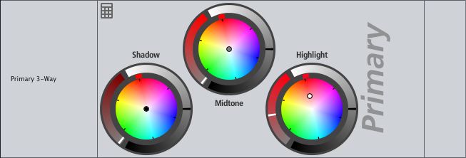
The heart of any color correction interface is the Color Balance Control UI. At a superficial level, I like the design of the wheels, with individual H, S, and L handles that are easy to understand and manipulate.
However, in practical use I find that the balance controls feel too granular. I dont know if this is simply the implementation on Final Cut Pro, or if it’s a limitation of my system (although my 8-core Mac Pro has no such problems with FCP’s Color Corrector 3-way or with Color’s) but there’s no smooth update within the image as I drag the color balance handle. Instead, the image color changes in pops, jumping from one set of values to another, which for me is unacceptable for making nuanced adjustments.
The color balance control UI also retains something I disliked in the original Colorista–the color balance handle jumps immediately to wherever you click within the color balance control. While this is fine for making massive corrections, its not that useful when you’re trying to make subtle re-adjustments to an existing setting and you don’t want to have to target the tiny balance handle to drag it relative to the previous correction. The jump-to behavior would be fine as a Command-click option, but as the default behavior, I don’t like it.
My last knock on the color balance controls is probably not Colorista’s fault, but I dislike the small size of the 3-way controls, and they don’t seem to scale up. I suspect this is a function of the API they’re using and the developers probably can’t do anything about it, but for a mouse-only color corrector it’s too bad the wheels can’t be enlarged for a more detail-oriented experience.
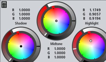
Time for something positive. I really like the calculator button that reveals a numeric UI (available for other controls in the plugin, too). It’s a very nice touch. It’s also an interesting design decision to express the color balance numeric controls in RGB values, more options are always good.
However, it would also have been good to provide an option for alternate HSL parameters for the balance controls. Furthermore, the lack of numeric UI for the three contrast sliders is an oversight, as is the lack of scroll wheel manipulation for the numbers. Perhaps this isn’t a big deal for dedicated UI users, but you never know when you’re going to want to compare numbers.
Lastly, I have mixed feelings about the Auto Balance control implementation. I like that it’s designed for you to sample a highlight of the image manually (which I generally feel provides the most flexibility for good results). However, I don’t like that it balances the shadows automatically at the same time. I’d honestly prefer separate shadow sampling, at least as an option. There are plenty of times where I want to leave the highlights alone (or perhaps just make a manual adjustment), but would like to auto-balance the shadows by themselves.
Contrast Adjustments
Shadow/midtone/highlight contrast control implementation is good, with plenty of room for making large adjustments. Relatively fine control is available if you move very, very slowly (insert Elmer Fudd joke here). However, like the balance controls they’re jumpy in practical use–again, this doesn’t lend itself to making subtle adjustments.
The Exposure and Primary Density sliders are very nice additions to one’s video grading toolset. My test footage was too well exposed to give me an opportunity to try out Highlight Recovery, but other reviewers have extolled its virtues, so I’m happy to believe them.
However, these sliders bring me to one other issue. Using a mouse’s scroll wheel to adjust any of the sliders in the UI is not useful–rolling the scroll wheel by any amount results only in a jump from the extreme left to the extreme right of the slider. I use my mouse wheel to adjust parameters elsewhere in FCP all the time, as it’s much more comfortable then constant clicking and dragging (especially for controls youll be adjusting in every single clip you touch), so this is an unfortunate oversight that I hope is changed in future versions.
RT Performance
Since colorists in a hurry often restrict themselves to color and contrast adjustments, I’m going to step out of the UI for a moment, to talk about real-time playback. I found Colorista II’s playback in Unlimited RT mode to be perfectly acceptable, though it could be better. I haven’t found it to be full frame-rate in real time, but it’s close for basic corrections, which at this level of work is fine.
The Fantastic HSL Controls
The HSL controls are extremely clever—in fact I feel this is the standout feature of Colorista II. They do the same thing as the Hue Curves or Secondary Curves in apps like Color, Scratch, and Baselight, but in a different way. I particularly like how control of Hue and Saturation has been unified within a single UI control, and unlike the Sat curve in Color (which I use all the time), it’s easy to boost saturation in targeted areas of the image by a large amount.
It’s worth noting that using using the Lightness HSL control breaks up highly compressed images a lot, but that’s no fault of Colorista, it’s a fact of life that’s true of any hue curve interface I’ve used when applied to highly compressed footage (this is one major pitfall of compression in grading). This feature fares no better or worse then any other comparable control I’ve used.
A minor nit, when comparing these controls to their curve equivalents in other apps, is that true curves allow additional control points to be added to finely sculpt hue and saturation. Colorista II’s controls, while fast and intuitive, lack this fine-tuning ability. However, I’m happily willing to concede that the majority of hue adjustments I typically make don’t really require that level of detail, so people will find these controls opening new vistas in creative (and quality control-fixing) possibility.
Personally, I feel that Colorista II is worth buying for this feature alone.
Bypass and Mix for Each Set of Controls
Bypass buttons for each set of controls (Primary, Secondary, Master) is a very nice touch, as you’ll probably find yourself doing before-and-after comparisons for specific secondary and mastering adjustments quite a lot. Even better, mix sliders also let you moderate how much each particular group of adjustments contributes to the overall correction. This is a small thing that will be extremely useful to anyone doing subtle work.
I also like the Mix slider at the very bottom of the filter, that lets you mix the overall filtered effect with the state of the image at that point of your filter stack. A very nice touch.
The Keyer
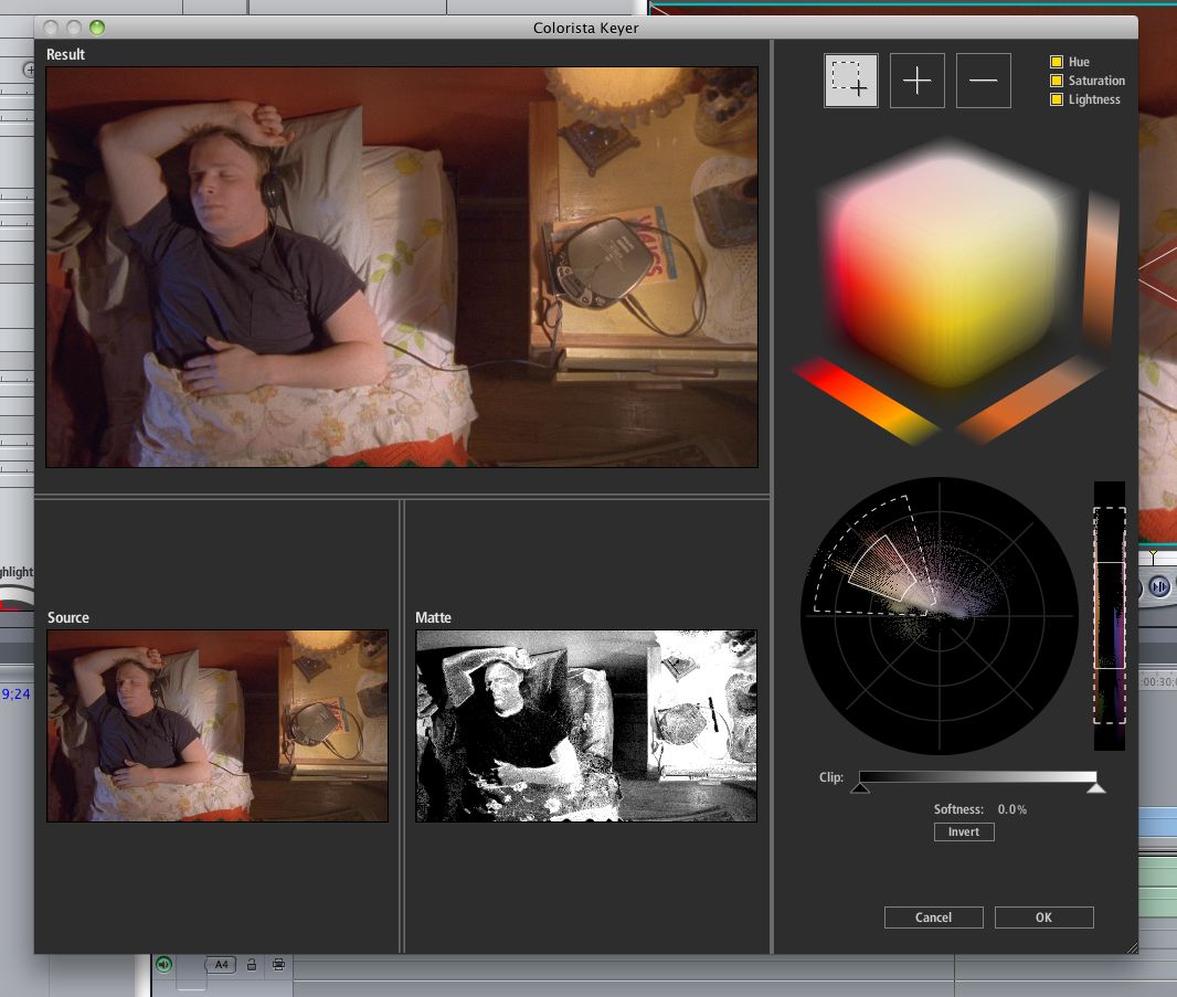
The keyer presents an evolved and forward-looking UI, that appears modally within its own window when invoked. I’m personally not convinced that it’s night-and-day better (as a UI) then the standard HSL controls found within every other color correction UI I’ve used (other then Avid), but on the assumption that the keyer is algorithmically unique and the UI supports this enhanced functionality, Im glad to see someone pushing the envelope.
More succinctly, I like it, particularly the vectorscope handles. Also, while they took some getting used to, I was glad to see the implementation of separate and de-selectable hue, saturation, and lightness controls over the key–pulling dedicated luma keys for various adjustments is a valuable technique.
For the click-to-sample crowd, the selection, add, and remove scrubber controls are well implemented, with a unique method of sampling initial image values via a bounding box, rather then as a drag operation. Other standout features of the keyer include the Clip slider that lets you adjust the contrast of the key to make it more solid, and the high quality blur of the Softness control.
One thing I miss, however, is the ability to play through a clip that I’m keying while adjusting the key; the keyer’s modal window prevents this. This is not insignificant, as keys that look perfectly fine on a still image often fall apart once you start playing the clip. At the very least, it would be nice to have a way to scrub through the clip while you’re working, to see how the key holds up when, for example, the camera pans towards the sun.
Knowing full well this is a feature request, something else I miss that I use frequently in Color is the ability to apply separate color and contrast adjustments both inside and outside of a key and/or mask. While the keyer provides an Invert button, that simply means you can choose whether to grade the outside or inside of the key, rather then being able to work on both with different settings.
Masking
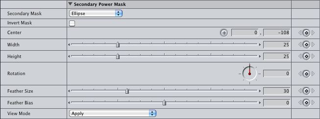
The simple built-in Power Mask controls are handy, interface limitations aside. However, I can’t hold that against Colorista II since the shape UI is no less kludgy then that of any other FCP plugin. That said, I’d dearly wish for some type of outline in the Canvas as an additional View Mode, should that be possible.
Being able to combine the mask and keyer is a fundamental feature that’s nicely implemented, with several options for different boolean combinations of the two (an innovation as this isn’t a feature you often see).
Lastly, the Master Mask provides an additional mask you can use, with boolean options for using it to either restrict the Master controls (thereby providing one more secondary), or combine it in boolean fashion with the mask thats already being used in the existing secondary. This flexibility is a nice touch, even if the resulting stack of parameters and controls is a bit unwieldy.
Pop Slider
The pop slider is great, and when used positively it makes a nice little contrast bump to increase image definition that I typically accomplish using luma curves. Reverse pop is also a nice effect for lightly feathering harsh image definition, although I can unfortunately see this feature get tediously overused in undiscriminating hands.
Master Controls
I really like that there’s a post-processing set of 3-way, saturation, and HSL controls at the end of the Colorista image processing pipeline. This provides a built-in way of trimming a correction that you’ve made, although depending on the context of the operation being performed, there are still ample times where you’ll want to do such trimming with an additional plugin (such as applying a single adjusting filter to an entire pre-balanced scene worth of clips).
Workflow issues aside, it’s good to have the ability to further modify the sum of primary and secondary corrections, or to use these controls with the Master Mask to have a second secondary correction.
Curve Controls
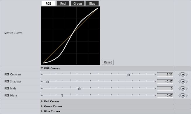
The curve controls are clever, given the limitations of the FCP environment. While it’s no substitute for a true, customizable multi-point curve UI, it’s a nice addition and quite useful for making those contrast-a-riffic s-curves.
I’ll go ahead and take the liberty of making a feature-request aside now–a bias control for controlling the midpoint of the contrast curve would be a handy addition in future versions.
Options
There are some interesting utilitarian options available at the bottom of Colorista II’s parameter stack. Flip Image is nice to have, except for the lack of independent control over vertical and horizontal orientation. As a result, it’s only good when you need to flip something in both dimensions. Of course, there are many other ways you can do this, so it’s not that big a deal.
Show Skin Overlay is a fun addition, although this is the kind of idiot-light I usually try to discourage people from leaning on too heavily, as it encourages overly specific skin tone manipulations that don’t necessarily interact with the illuminant of the scene in a convincing way (something I’ve been meaning to write an article about, but haven’t gotten to yet). I’d need more testing, but I’m also curious to see how much of the possible range of human skin tone hue this overlay encompasses–the tyranny of an overly strict adherence to the I-bar’s angle is also something I try to discourage in students.
I find it interesting that there’s a pop-up menu that lets you specify whether to render using your computers GPU or CPU. As there are usually subtle image processing differences when using different GPUs, this gives the potential for rendering reliably predictable grades in multi-computer shops with different graphics cards. I’ve not tested to see what the performance penalty is, if any, when switching between GPU and CPU on a more capable workstation with a beefier graphics card, but it’d be interesting to see if anyone cares to try.
Other Observations
The wealth of features in Colorista II is impressive, but they also reveal a deficiency of the FCP filter interface, which is the inevitable big stack of UI elements that necessitate endless scrolling up and down the Filter tabs list to make various adjustments. This isn’t Coloristas fault, it’s a foible of FCP, but Colorista’s numerous options force one to deal with it. It’s perhaps an unfair observation as the developers do their best to manage the clutter with disclosure triangles for each set of parameters, but even so I’m just not a fan of all the scrolling.
Another deficiency is the seeming lack of keyframing for the fancier UI controls (3-Way, HSL, Keyer). The keyer I can overlook (though keyframing the HSL controls of a Key has saved me once or twice in the past), but not being able to keyframe the 3-Way, and by extension the 3-way contrast controls, is a huge drag for instances where I’m correcting for an in-camera auto-control exposure change, or any one of innumerable instances where animating a correction is important. Hopefully I’m either overlooking the way to do this (although I’ve looked hard), or this feature makes its way into future releases.
Finally, in one last feature-request aside, I’d like to see a dedicated reset button for each stage of correction in addition to the plugin-wide reset (similar to the reset button on the Master Curves). It’s a small thing, but would be helpful since going into numeric mode and resetting a bunch of numbers one by one is kind of a drag.
In Conclusion
So those are my thoughts, good and bad. I’ll probably pick up a copy sometime down the road for instances where I’m working inside of Final Cut Pro on specific sections of a program. However, as I mentioned in my preamble, I remain a fan of the dedicated grading app. Specific color adjustment features are only part of the picture; the overall color correction environment provides many additional benefits in terms of session organization, working speed, operator comfort and efficiency, and artistic subtlety.
However, to end on a positive note, I want to emphasize that as critical as I am of specific features, I still think that Colorista II is a useful plugin that aims high, and will absolutely expand the range of creative possibility available to you from within your NLE of choice (or AE, if you swing that way). Give it a look.
UPDATE—I broke down and did what I should’ve in the first place—added some screenshots of the Colorista II interface and a link to the Red Giant website, and a few more edits for clarity.




7 comments
Hello. Excellent review. A question: I like more lift, gamma and gain on primary, do you think those are better than shadow, midtone and highlight? Thanks
Glad you liked the review, Manuel. In most applications, lift/gamma/gain controls are synonymous with shadow/midtone/highlight controls.
Sometimes there’s a difference between a “lift” and a “shadow control.” The definition of a true “lift” is an additive operation that uniformly increases the gain of the entire image, making everything lighter or darker at once. On the other hand, a true “shadow control” raises the black point of the image while leaving the white point (highlights) unchanged, scaling all of the midtones in-between, which makes the shadows a lot lighter or darker, the midtones a little lighter or darker, and leaves the highlights alone.
Both controls are fast for different operations, but I’m personally a “shadow slider” kind of guy, since it makes it a bit easier to compress or expand the shadows relative to the highlights. Colorista II has a shadow control.
Thank you. I look forward to your new book.
[…] Taking a Quick Look At Colorista II by Alexis Van Hurkman This entry was posted in Editing and tagged Colorista, Red Giant Software, Review, Scott Simmons, Stu Maschwitz. Bookmark the permalink. ← Netflix Streaming Coming to Canada […]
Great review. You hit on every limitation I’ve encountered myself using Colorista II. I’ve been giving it a try over Color and while very useful as a quickie tool, I find myself moving much slower than I do in Color. I agree that a lot of the limitations are a result of FCP’s own dated UI.
I was wondering if you could answer a question that I’ve been wrestling with.. I’ve been searching through flame wars in forums and can’t seem to get a straight answer. Is any one software better in terms of QUALITY for color correction? In other words, will one software leave my image less broken down, muddy, blocky, etc.. For instance, if I were to use a curves adjustment and then a three way color corrector theoretically using the exact same settings, would quality degradation be more or less prevalent in after effects, premiere, colorista, resolve, or speedgrade? Maybe their secret sauces and algorithms are different in pushing and pulling colors? Or is it using a matrix that may vary a bit but the quality is not affected? I’m very tempted by the latest version of colorista that just came out in conjunction with the ability to motion track and use real masks within premiere (allowing me to stay within premiere), but if I am going to take a hit on quality in any form, I will go to speedgrade or something else.
Any idea?
Thanks so much!
As far as I’m concerned, you can do high quality work with any of the solutions you’ve mentioned, Resolve, SpeedGrade, Scratch, Baselight, After Effects, Premiere Pro, Magic Bullet, Final Cut Pro X, what have you. In terms of pure quality, I’m sure different vendors could choose to nitpick the quality of a particular operation in one app versus the same in another, but I honestly think that looking at the basics of image processing adjustments, you can get where you need to go in ANY of the above solutions and produce a high-quality image. All modern software has good image processing, far as I’ve seen.
That said, not all apps are created equally in terms of efficiency of color correction workflow, and of course everyone has their own opinion about what software they prefer to use in that regard. I’m not going to take any sides here, because the price/performance/efficiency dial has many positions, and you can do well with any combination of apps and plugins you like providing you have the time and expertise for that solution. Also, the best solution may well depend on the type of project you’re working on.
Grading inside of your NLE makes your workflow easier in terms of not having to move your timeline between apps, and you can reap efficiencies by having your grades live with your edit, and keep reediting to your heart’s content. On the other hand, dedicated grading applications such as Speedgrade or Resolve are built to work quickly and speed up your grading workday, and offer many more dedicated tools for color tweaking then the average NLE. Both sets of tools have a learning curve, though a grading app’s learning curve may well be steeper simply because of the greater variety of grading tools available within.
In making your choice, I’d say that workflow should probably be your primary concern. Whatever software you pick, the quality of the result is more up to your ability then it is the app itself, pretty much all applications are capable of high-quality processing.