I’ve been thinking a lot about HDR in the last three years, not only as a colorist who’s also taken it upon myself to try and explain why this new development is so exciting to a wider audience, but as a director who’s done three projects intended for HDR mastering who’s keen to make sure that what’s done on set gives the most efficient starting point for the eventual HDR grade. As I’ve spoken to folks about HDR, I’ve always tried to make clear that one of the things I like about how this new display technology is rolling out is that there are no rules for how it’s used.
There’s no one-size-fits-all approach to grading HDR, and there are no hard and fast rules for how to map different highlights to different levels, just like there are no rules for choosing specifically what values different shadow levels are supposed to appear at. Grading HDR is a matter of creative decision-making, which is incredibly exciting for everyone who exercises control over narrative imagery.
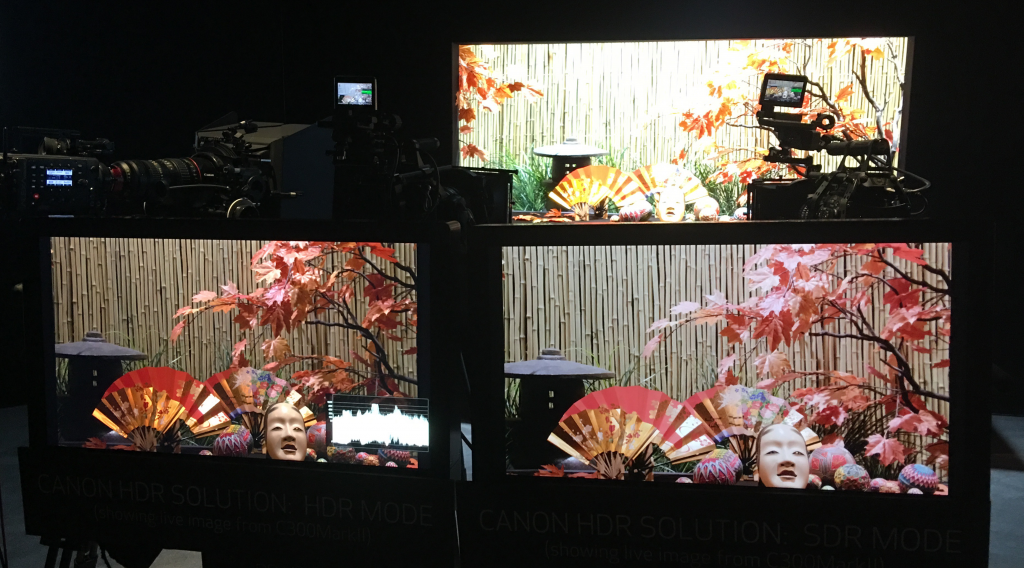
That’s not to say there aren’t technological limitations that are important to keep in mind in terms of what percentage of the image can be graded up to HDR highlight levels and accurately reproduced on consumer displays. Display capabilities are a moving target as new TVs with new capabilities come out every year. Prudent coloristists make themselves aware of what consumer televisions are capable of, and how the HDR mastering standard they’re adhering to (such as Dolby Vision, HDR10, or the HDR10+ family of standards) deals with out-of-bounds levels, because this partially informs how one chooses to distribute one’s pixels of brightness.
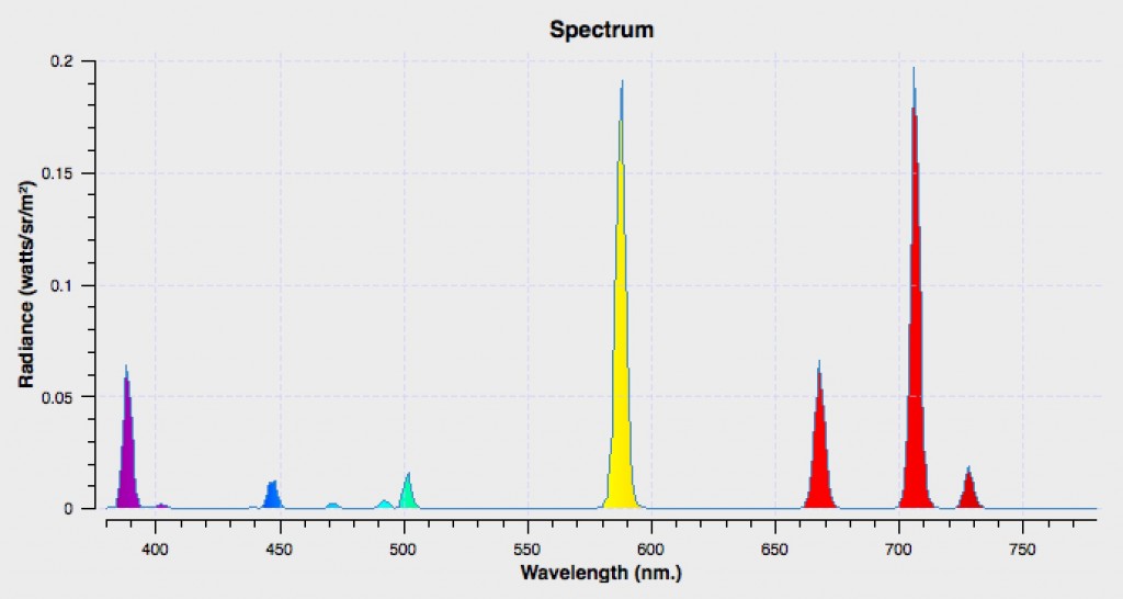
For many display technologies, having too many HDR-bright pixels at too high a level triggers Automatic Brightness Limiting (ABL) to limit power consumption and protect the panel. This means you end up having an HDR highlights pixel budget of what percentage of the image you can distribute among low, medium, and high levels of HDR highlights. At least, that’s how I choose to look at it in the work I’ve done, and it’s served me well.
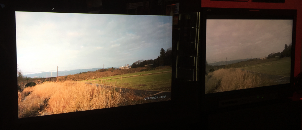
In my experience, this isn’t the worst thing, because these limitations reinforce the very purpose of HDR; HDR grading is about using the additional headroom to make highlights more energetic, more varied, more detailed, and more saturated, instead of having to compress, clip, or desaturate them as we must to fit all highlights into the limited range of SDR. HDR is not about making the overall picture brighter, just making the brightest parts of the image brighter, as desired.
This focus on HDR being about better highlights also means that the shadows and midtones, which are nearly always the majority of a dramatically-exposed image, remain down in the good old SDR range of values that cinematographers and colorists are so used to. Let me say that again, it’s typical for the shadows and midtones of SDR and HDR images to be similar.
That’s not to say that there hasn’t been an evolution of thinking as everyone gets more experience grading HDR images. For example, there’s been a wide consensus among professionals I’ve spoken with that images with HDR highlights benefit from somewhat brighter “diffuse white” levels. Diffuse white, or “reference white,” defines the level of light reflecting off a sheet of flat matte white substance (with no specular highlights) that reflects evenly at all wavelengths. Think a white sheet of paper, a white t-shirt, or a matte white wall. Slightly elevating reference white guarantees that, to the viewer, ordinary matte whites still appear as white relative to the even “whiter” hard white highlights that HDR can add to an image. You don’t want a flat white t-shirt looking gray.
This thinking is reflected in BT.2390, which is a recommendation to use a linear scale operation to increase the level of Standard Dynamic Range material so reference white levels hit 200 nits when mixing SDR and HDR media together, as when you mix archival SDR footage with new HDR material in a documentary. This way, the SDR material doesn’t look so dingy when compared to the popping highlights of HDR. This thinking is also reflected in BT.2408, which is a recommendation for a 203 nit Reference White target in one’s HDR grading. Yes, this means that higher shadows and high midtones may get a little bit brighter (depending on how you grade), but this is in the interest of having the rest of your image not seem dingy compared to the HDR highlights being sprinkled around your image. Absolute black stays down at 0 percent, and the darker shadows more or less stay where they are (depending on how you like to grade). In my experience, this is a good general guideline, although your implementation will vary depending on your creative decision-making and the scene at hand.
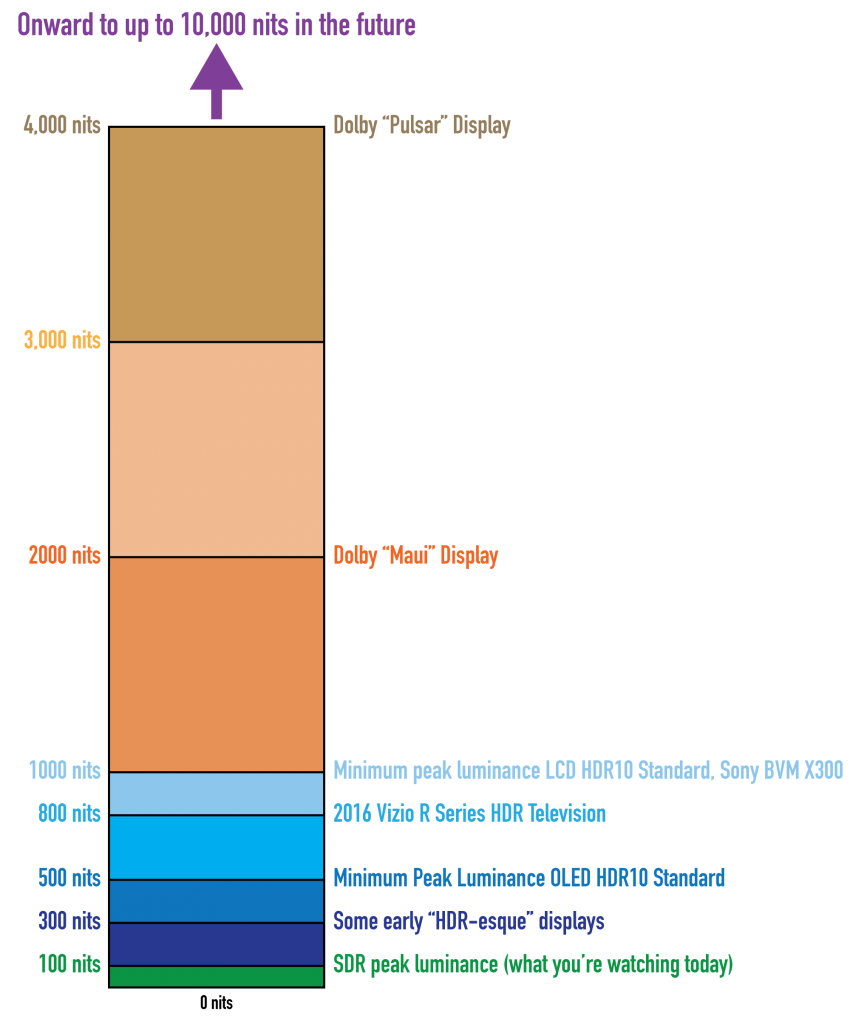
So, there are increasingly recommendations about how to redistribute the SDR-ish values (shadows, midtones) within an HDR grade in which the increased dynamic range is being used to create a significant differentiation between different kinds of highlights, but they’re just that, recommendations. Many programs are choosing to master to a maximum level of 1000 nits for HDR highlights, since that’s a reasonable average of what consumer televisions can do at the moment (whether or not this is the right thing to do is an entirely different article). With 800 additional nits of highlight range to choose from, you can now have dim highlights, medium highlights, and bright highlights that are 200 nits apart from one another, as opposed to having similar levels of image highlights being only up to 10 nits different if you’re using 90 to 100 percent of an SDR image for the same range of diffuse whites to sun glints. But how you use this range is entirely image and content dependent.
Getting back to the Mandalorian, when I read the Ars Technica post about the HDR grading in The Mandalorian being “fake HDR,” I chuckled. I get what I believe the author is trying to say, which is that the way HDR is used in the show is not spectacular enough to make owning an HDR television feel worthwhile to audiences who want to turn the video up to 11. If all the author said was they didn’t like the grade and wished the highlights were brighter, that’s an opinion reflective of the author’s tastes, and I’d have no reason to argue. Taste is taste. Whatever.
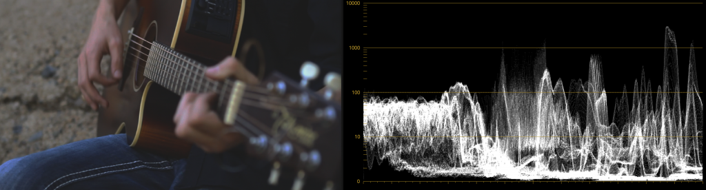
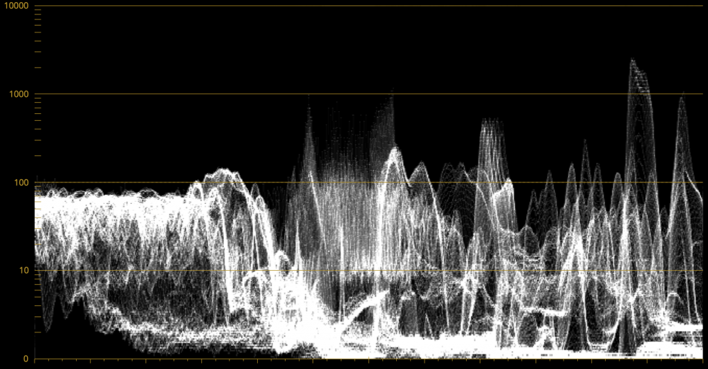
However, citing television display capabilities and a “test” that to quote the author, “heat-mapped the image for the YouTube video to make it clear how bright each part of the image is…” to observe that “…at no point did any part of the image in The Mandalorian—even highlights like blaster fire, a forge of molten metal, or the Sun—appear at more than 200 cd/m².” and thus accuse the program of being “faux HDR” is misguided. The author goes on to write “the image looks awfully dim and isn’t living up to expectations.” Having lived through the “Battle of Winterfell” debate, I can safely say that if every episode of The Mandalorian is too dark, they should check that their TV is working properly, it looks nicely exposed to my eye.
HDR display specifications are only for governing the required capabilities of one’s display to be able to reproduce HDR images properly. These specifications say nothing about how you should grade any given program, beyond a general description of the purpose of HDR, with an implied warning not to overdo things if you want what is promoted as the HDR effect of perceptually spectacular highlights in direct comparison to lower level shadows and midtones (in other words, don’t just scale the brightness of the entire image up).
Even if you’re grading a program with scenes that are using HDR’s full highlight-popping capabilities, creatively speaking you’re not going to do so in every shot of every scene. A typically graded program will and should have wide variation in how one chooses to use HDR, depending on the content of a given scene and the look and mood the director, cinematographer, and colorist are going for.
In fact, there’s no requirement that you use maximum HDR strength highlights at all, much less forcing you to use some arbitrarily high level just to use the available range. How you use these levels is entirely up to your creative team.
One of the things I’ve learned grading my own directorial efforts is that the extreme dynamic range afforded by HDR makes it tempting to boost perceived contrast so far beyond what cinema viewers are used to that the image begins to look like live television. To make one’s dramatic images play into audience expectations of what a capital M movie is supposed to look like actually requires a lot of restraint, and I find that when grading HDR I pay an enormous amount of attention to grading my shadows to strike just the right balance between darkness and black, and to counterbalance the distribution of the highlights I’m choosing to map. Just because you can do certain things doesn’t mean you should. But again, these are purely aesthetic choices and opinions. There’s no rule about any of this, nor should there be. And I’m sure that as time goes on, our collective opinions about what “looks cinematic” will evolve as well. New fashions in image-making and grading will emerge, and the wheel of punditry will turn.
I’ve watched every episode of The Mandalorian that’s been released so far, and it’s clear to me that its use of HDR is deliberate and intentional. In my opinion, the grade is a nice nod to the look and feel of the original movies by being classically restrained in the distribution of shadows, midtones, and saturation, while sprinkling moderate HDR highlights into the image that are compatible with the overall vibe they’re selling. No part of the grade has distracted me from simply watching the series, and yet overall it looks great on my OLED LG TV. I want to congratulate cinematographers Barry Baz Idoine and Greig Fraser, colorist Steve Scott and his collaborators Charles Bunnag and Adam Nazarenko at Company 3 (apologies for getting these names wrong earlier), and all the people who were collectively responsible for all aspects of the image during the shoot and in post on their clever blend of old and new.
So, is the lighting and grading good? That depends on each viewer’s opinion and I’m not going to argue that point (I think it is). Does this restraint make it objectively bad HDR? No. That presupposes there’s a “good” amount of HDR to use, which is like complaining they didn’t use as much saturation as they could have, or that every scene didn’t maximize the dynamic range of the audio mix.
I have spoken.