
High Dynamic Range (HDR) video describes an emerging group of monitoring, video encoding, and distribution technologies designed to enable a new generation of television displays to play video capable of intensely bright highlights and increased maximum saturation. I’ve been keen on this technology ever since I first saw demonstrations at the 2015 NAB conference, and I’ve had the good fortune to sit with some excellent colorists who’ve been grading HDR projects to see what they’ve been doing with it. I’ve also managed to work on a few HDR grading jobs myself, on two different HDR displays, which was the point at which I felt I had something interesting to contribute to the topic.
While I’d started, many weeks ago, to write an overview of HDR for folks who are interested in what’s going on, the growing enormity of the article caused it to be unfinished when I paused to attend the 2016 NAB conference to see this year’s update of what directions HDR seems to be taking. In the process, I also was invited to participate on a panel moderated by colorist Robbie Carman and hosted by Future Media Concepts on which Katie Hinsen (Light Iron), Marco Solorio (One River Media), Bram Desmet (Flanders Scientific), Robert Carroll (Dolby), Joel Barsotti (SpectraCal) and I got to chat about HDR. Happily, it seems that most of what I’d written before NAB was in line with the experiences of others in the field, providing both confirmation and a sense of relief that I was on the right track.
In this article, I provide a summary, from a colorist’s perspective, of what HDR is, what the different flavors of HDR distribution look like right now, and how HDR works inside of DaVinci Resolve (this article is a vast expansion of a new section on HDR I added to the DaVinci Resolve 12.5 User Manual). Lastly, I try to provide some food for thought regarding the creative uses of HDR, in an effort to get you to think differently about your grading in the wake of this wonderfully freeing and expanded palette for viewing images.
Before I continue, I want to give thanks to some folks who generously provided information and answered questions in conversation as I developed this piece, including Robert Carroll and Bill Villarreal at Dolby, colorist Shane Ruggieri, Bram Desmet at Flanders Scientific, and Gary Mandel at Sony. I also want to thank Mason Marshall at the Best Buy in Roseville Minnesota, who was able to give me a quite knowledgeable tour of the actual consumer HDR televisions that are for sale in 2016.
What Is It?
Simply put, HDR (High Dynamic Range) is an escape from the tiny box, as currently defined by BT.709 (governing color gamut), BT.1886 (governing EOTF), and ST.2080-1 (governing reference white luminance levels), in which colorists and the video signals/images they manipulate have been kept imprisoned for decades.
HDR for film and video is not the same as “high dynamic range photography,” which is a question I’ve gotten a few times from DPs I know. Whereas High Dynamic Range photography is about finding tricky ways of squeezing both dark shadow details and bright highlight details from wide-lattitude image formats into the existing narrow gamuts available for print and/or on-screen display, HDR for film and video is about actually expanding the available display gamut, to make a wider range of dark to light tones and colors available to the video and cinema artist for showing contrast and color to viewers on HDR-capable displays.
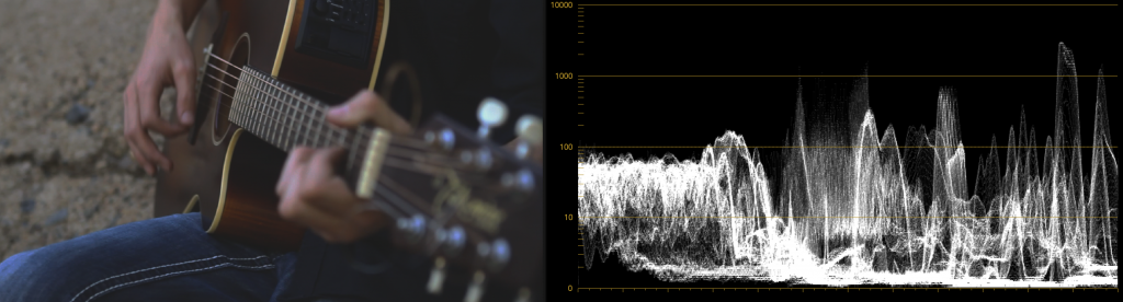
It’s impossible to accurately show what HDR looks like in this article, given the screen you’re likely reading this on is not HDR, because the levels I’m discussing simply cannot be visually represented. However, if you look at a side-by-side picture of an HDR-capable display and a regular broadcast-calibrated BT.709 display, with the picture exposed for the HDR highlights, it’s possible to see how the peak highlights and saturation on both displays compare, relative to one another. In such a picture, the comparative dimness of the BT.709 display’s highlights is painfully obvious. The following (admittedly terrible) photo I took at NAB 2016 gives you somewhat of an idea what this difference is like. To be clear, were you to see the SDR display to the right by itself, you would have said it looks fine, but in contrast to the HDR image being displayed at the left, there’s no comparison.
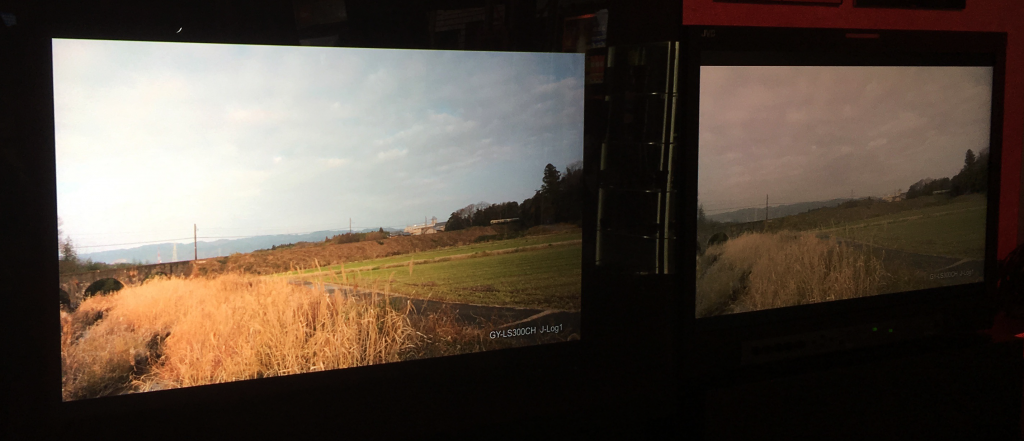
4000 nit HDR Output on a rear-projection JVC display (left), versus 100 nit SDR Output (right)
Another approach to illustrating the difference between High Dynamic Range and BT.709 displays is to show a simulation of the diminished highlight definition, color volume, and contrast of the BT.709 image in a side by side comparison. Something similar can be seen in the following photo of a comparison of two images from the same scene represented on Canon reference displays. At left is the HDR image, at right is the BT.709 version of the image.
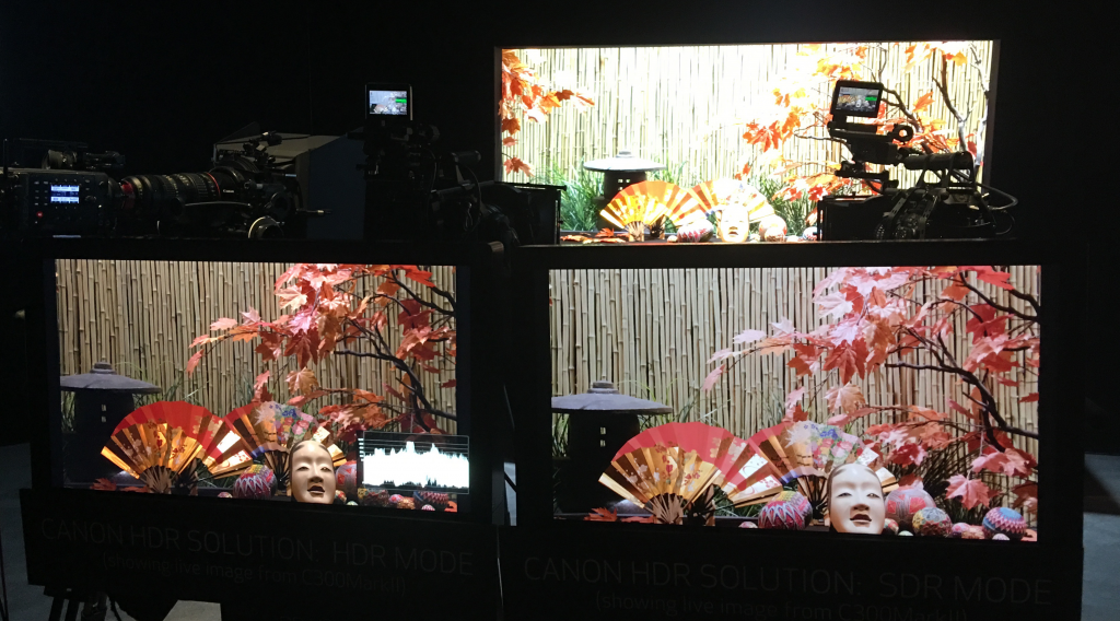
HDR (left) compared to a BT.709 rendition (right) of the same scene (above), on Canon displays
Again, these sorts of example images give you a vague impression of the benefits of HDR monitoring, but in truth they’re an extremely poor substitute for actually looking at an HDR display in person.
So, HDR displays are capable of representing an expanded range of lightness, and in the process can output a far larger color volume than previous generations of displays can. However, this expanded range of color and lightness is meant to be used in a specific way, at least for now as we transition from an all “Standard Dynamic Range” (SDR) distribution landscape, to a mixture of SDR and HDR televisions, disc players, streaming services, and broadcast infrastructure, using potentially different methods of distributing and displaying HDR signals.
The general idea is that much of the tonal range of an HDR image will be graded similarly to how an SDR image is graded now, with the shadows and midtones being treated similarly between traditionally SDR and HDR-graded images in order to promote wider contrast, maintain a comfortable viewing experience, and to ease backward compatibility when re-grading for non-HDR displays. “Diffuse white” highlights (such as someone’s white shirt), are where the expanded range of HDR begins to offer options for providing more vivid levels to the viewer. HDR’s most immediately noticeable benefit, however, is in providing abundant additional headroom for “peak” highlights and more intense color saturation that far exceeds what has been visible (without clipping) in SDR television and cinema up until now.
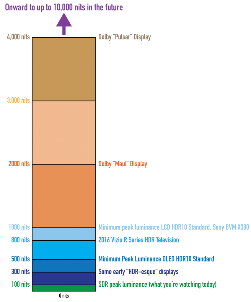
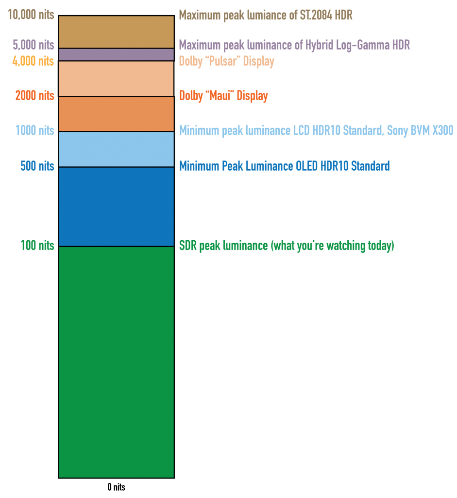
For example, a reference SDR display should have a peak luminance level of 100 “nits” (cd/m2), above which all video levels are (probably) clipped. Meanwhile, today’s generation of professional HDR displays have peak luminance levels of 1000, 2000, or even 4000 nits (depending on the model and manufacturer), and support at least most of the expanded P3 gamut for color. Eventually, televisions capable of displaying even brighter highlights (Dolby Vision and BT.2084 support levels up to 10,000 nits) and expanded color saturation (reaching out towards the promise of BT. 2020) may become available.
And these peak HDR-strenth highlights look spectacular.
Why Is This Cool?
Frankly, the only way to answer this question is to finagle yourself into an HDR screening. I can type until my fingers cramp about how wonderful all of this is, but without seeing it for yourself, the benefits of HDR are a bit abstract. Once you’ve seen it, you’ll know why it’s cool, why you’ll want to shoot your next project with HDR in mind (as I am), and why getting your hands on HDR as a colorist will be enormous fun. I’ve now sat in on several different HDR demonstration screenings, grading sessions, and theatrical viewings, and have had a few HDR grading gigs of my own, and everyone I’ve talked to afterwards, both colorists and clients, has been almost immediately enthusiastic.
The core benefits of HDR, as I see them, are two-fold.
Firstly, you can have portions of the highlights of your image exhibit extremely bright specular highlights, glints, and sparkles with far greater visible detail within these areas because much of the detail within these highlights won’t clip. Practically, this means that instead of clipping all highlights above 100 nits (ST.2080-1 standardizes the peak luminance that’s associated with displays set to output BT.709/BT.1886), now you can see the difference between a 100 nit detail, a 300 nit detail, a 500 nit detail, and an 800 nit detail within such a highlight, assuming you’re looking at an HDR display capable of showing you that range. There’s simply no comparison.
If we look at a linear vertical representation of these values, similarly to how we’d plot the scale of a waveform monitor, it becomes immediately obvious what a difference this is. Keep in mind that the little tiny green slice at the bottom of the illustration represents the total range of luminance that’s available to colorists in a conventionally graded BT.709/BT.1886/ST.2080-1 image.
Secondly, and to me almost more importantly, richly saturated colorful and bright image details such as neon lights, emergency vehicle lights, backlit tinted glass, explosion effects, firelight, skin shine and bright highlights, and other saturated reflective areas and direct light sources, as well as the glows and volumetric lighting effects they emit, may carry saturation well above the 100 nit level on an HDR display, which is a creative choice previously forbidden to colorists, who had to be sure to compress color saturation somewhat below the 100%/100 IRE/700 mV maximum allowed by most conservative QC specifications for broadcast television just to be on the safe side. With HDR, you no longer have to crush the life out of vividly bright highlights to squeeze them onto TV, you can actually leave them be, and revel in the abundance of smear-free extra saturation and detail you can allow in the highlights of sunsets, stained-glass windows, Vegas-style signage, and other brightly-lit areas of colorful detail.
Now, the illustration above, while exciting, is not quite accurate, in that the human eye has a logarithmic response to highlights. Practically speaking, this means that our eyes perceive a difference between two very bright levels as a smaller percentage of what that difference actually is. This is one reason why we can handle going outside on a sunny day without being blinded, when there are reflective nit levels all over the place that are off the chart of what we see on an SDR television or in an SDR movie theater. Not coincidentally, HDR signals are logarithmically encoded for distribution, and if we look at an actual logarithmically compressed waveform scope scale for evaluating HDR media, we get a somewhat more comprehensible comparison of SDR and HDR signals, that’s a bit more actionable from the colorist’s perspective.
Another advantage to HDR displays is that, since viewers experience contrast as the difference between the brightest and darkest pixels within an image, and since edge contrast is a visual cue for sharpness, having dramatically brighter pixels, even a few of them in the top highlights, means that the perceived contrast of the image will be dramatically higher, and details will appear to be much crisper. My experience from looking at a few HD-resolution HDR displays at NAB 2015 was that they appeared to be sharper than some of the 4K displays I was seeing, because HDR highlights add contrast that make the edges by which we evaluate sharpness really pop. Combining HDR with 4K will be an exceptional viewing experience no matter how huge your living room television is.
One last advantage to HDR for distribution is that, with few exceptions, HDR distribution standards require a minimum of 10-bits to accommodate the wide range being distributed (HDR mastering requires 12-bits). Even though that 10-bits will be stretched more thinly than with an SDR signal, given the expanded latitude of HDR, this hopefully means that a side benefit of HDR will be a reduction in the kind of 8-bit banding artifacts in shadows and areas of shallow gradated color such as blue skies or bare walls that we’ve been cursed with ever since television first embraced digital signals. That alone is worth the cost of admission.
Another interesting thing about HDR is that, unlike other emerging distribution technologies such as Stereo 3D, high-frame-rate exhibition, wide gamuts, and ever-higher resolutions (4K, 8K) which engender quite a bit of debate about whether or not they’re worth it, HDR is something that nearly everyone I’ve spoken with, professional and layperson alike, agree looks fantastic once they’ve seen it. This, given all the griping about those other technologies I’d mentioned, is amazing to me. Furthermore, it’s easy for almost anyone to see the improvement, no matter what your eyeglass prescription happens to be.
(Updated) However, because it’s an emerging technology, the technical standards being promulgated at the moment exceed what the first few generations of consumer displays are capable of. I had a look at what’s on store shelves at the time of this writing in 2016, and depending on the make and model you get, consumer televisions are “only” capable of outputting a maximum of 300, 500, 800, or 1000-1400 nits peak luminance. Capabilities vary widely. Moreover, because display manufacturers are racing one another to improve each subsequent generation of consumer televisions, HDR standards for peak brightness are a moving target. While HDR this year means peak luminance of 300–1000 nits, maybe next year will bring a 2000 nit model. The year after that, who knows?
Because of this, two of the proposed mastering methods of HDR have been designed to accommodate up to 10,000 nits, while one other will accommodate up to 5,000 nits. Of course, no current television can get anywhere even remotely close to either of these maximum levels, but the Dolby Pulsar, which has the highest nit output display in use for mastering HDR (at the time of this writing), is capable of displaying an HDR signal with a peak luminance level of 4,000 nits, making this the de facto reference at facilities lucky enough to be grading programs from movie studios and content distributors that are mastering for Dolby Vision. Many other facilities are using 1000 nits as a more achievable de facto reference given that’s what the Sony BVM X300 HDR display is capable of doing.
This basically means that many colorists are grading and mastering programs to be future-proofed for later generations of television viewers with better televisions, and in the short term different strategies are employed to deal with how these higher-than-currently-feasible peak HDR-strength highlights will be displayed on the first generations of consumer HDR televisions.
Automatic Brightness Limiting (ABL)
There’s one other wrinkle. Consumer HDR displays have legally mandated (regulated by the California Energy Commission and by similar European agencies) limits on the maximum power that televisions can use in relation to their size and resolution. Consequently, automatic brightness limiting (ABL) circuits are a common solution manufacturers use to limit power consumption to acceptable and safe levels for home use. Practically speaking, an ABL circuit limits the percentage of the picture that may reach peak luminance without automatically dimming the display. This type of ABL limiting is not required on professional displays, but some manner of limiting may still be used to protect the display from damage stemming from drawing more current than they can handle in exceptionally bright scenes.
Naturally, on my first HDR grading job I was keenly interested in just how much of the picture could go into very-bright HDR levels before the average consumer HDR-capable TV would interfere, since I didn’t want to push things too far. Unfortunately, nobody could tell me what that threshold was at the time, so I simply proceeded with caution, grading relative to the 30″ Sony BVM X300 display we were using as our HDR reference display (and a beautiful monitor it is). The grade went well, I tried to be judicious about how far I pushed the brightest of the signal levels, and the client went away with a master that made them happy (sadly, it was a secret project…).
Later, I had the good fortune of speaking with Gary Mandle, of Sony Professional Solutions, who illuminated the topic of how ABL affects the HDR image, at least so far as the BVM X300 is concerned. A number of different rules are followed, all of which interact with one another:
- In general, only 10% of the overall image may reach the X300’s peak brightness of 1000 nits (assuming the rest of the signal is back down at 100 nits or under)
- The overall image is evaluated to determine the allowable output. An extremely simple (and certainly oversimplified) example is that you could (probably) have 20% of the signal at 500 nits, rather than 10% at 1000 nits. I have no idea if this kind of tradeoff is linear, so the truth undoubtedly varies. The general idea is that if you only had, say 2% of the image at 1000 nits, and 5% of the image at 500 nits, then you can probably have a reasonable additional percentage of the image at 200 nits, which is by no means at the top of the range, but is still twice as bright as SDR (standard dynamic range) images that peak at 100 nits. I don’t know what the actual numbers are, but the basic idea is the total percentage of pixels of HDR-strength highlights you’re allowed to have depends on the intensity of those pixels.
- The dispersion of image brightness over the area of the screen is also evaluated, and output intensity is managed so that areas with a lot of brightness don’t overheat the OLED panel.
Long story short, how ABL gets triggered is complicated, and while you can keep track of how much of the image you’re pushing into HDR-specific highlights, how bright those highlights are, and how clustered or scattered the highlights happen to be, there will still be unknowable interactions at work. Fortunately, the Sony BVM X300 has an “Over Range indicator” light, which illuminates and turns amber whenever ABL is triggered, so you know what’s happening and can back off if necessary. Incidentally, it’s worth noting that the X300, being an OLED display, is susceptible to screen burn-in if you leave bright levels on-screen for too long, so don’t leave an HDR image on pause going out to your display before going home for the evening.
Bram Desmet, CEO of Flanders Scientific, pointed out that VESA publishes a set of test patterns (ICDMtp-HL01) devised by the International Committee for Display Metrology (ICDM) which can be used to analyze a display’s (a) susceptibility to halation, defined as “the contamination of darks with surrounding light areas,” and (b) susceptibility to power loading, which describes screens “that cannot maintain their brightest luminance at full screen because of power loading.” The set consists of two groups of ten test patterns. Black squares against white backgrounds are used to measure halation, while white squares against black backgrounds are used to measure power loading. For the power loading patterns, the ten patterns feature progressively larger white squares against a black background labeled as L05 to L90; the number indicates what diagonal percentage of the screen each box represents (which I’m told is different from a simple percentage of total pixels).
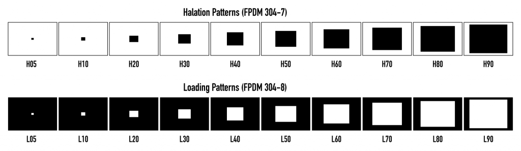
By measuring a display’s actual peak luminance while outputting progressively larger white boxes on black backgrounds, you can determine the maximum percentage of screen pixels that are possible to display at full strength before peak luminance is reduced due to power limiting. Of course, this doesn’t account for all the factors that trigger ABL, but it does provide at least one comprehensible metric for display performance, and some display manufacturers cite one of these test patches as an indication of a particular display’s performance.
Of course, the ABL on consumer televisions is potentially another thing entirely, as each manufacturer will have their own secret sauce for how to handle excess HDR brightness that exceeds a given television’s power limits. Hopefully, consumer ABL will be close enough to the response of professional ABL that we colorists won’t have to worry about it too much, but this will be an area for more exploration as time goes on and more models of HDR televisions become available.
(Update) In fact, I had just published this article when I had to run over to Best Buy to purchase a video game for a friend who I’ve decided is entirely too productive with their time. While I was there, I had a look at the televisions, and in the course of chatting about all of this (because I can’t stop), associate Mason Marshall pointed out a chart at rtings.com that does the kind of test chart evaluation I mention previously to investigate the peak luminance performance of different displays as they output different percentages of maximum white. The results are, ahem, illuminating. For example, while the Samsung KS9500 outputs a startling 1412 nits when 2% of the picture is at maximum white, peak luminance drops to 924 nits with 25% of the picture at maximum white, and it drops further down to 617 nits with 50 percent of the picture at maximum white. Results of different displays vary widely, so check out their chart. Now, this simple kind of Loading Pattern test isn’t going to account for all the variables that a display’s ABL contends with, but it does show the core principal in action of which colorists need to beware.
Dire as all this may sound, don’t be discouraged. Keep in mind that, at least for now, HDR-strength highlights are meant to be flavoring, not the base of the image. My experience so far has been if you’re judicious with your use of very-bright HDR-strength highlights, you’ll probably be relatively safe from the ravages of ABL, at least so far as the average consumer is concerned. Hopefully as technology improves and brighter output is possible with more efficient energy consumption, these issues will become less of a consideration. For now, however, they are.
More About Halation
Because of the intense light output required by HDR displays, different backlighting schemes are being developed to achieve the necessary peak luminance while attempting to keep power consumption economical. This is a period of rapid change in display technologies, but at this point in time some displays may exhibit halation in certain scenes, which can be seen as a fringing or ringing in lighter areas of the picture that surround darker subjects. These artifacts are not in the original signal, but are a consequence of a display whose backlighting technology is susceptible to this issue. This is the reason for the Halation test patterns described above, and it’s something you should keep an eye out for when looking at HDR displays you want to use for professional work.
Terminology in the Age of HDR
The advent of HDR requires some new distinguishing terminology, most of which has already been used in this article. Still, in the interests of clarification, SDR, or Standard Dynamic Range, describes video as has been previously experienced on conventional consumer televisions, where we talk about a display’s EOTF (electro-optical transfer function) being (hopefully) governed by the BT. 1886 standard, and your peak luminance level is probably (if you’ve calibrated) 100 nits as defined by the ST.2080-1 standard. Of course, standards compliance is entirely dependent on you and your clients choosing the correct settings on your displays, and maintaining the calibration of said displays on a regular-enough basis.
If you want to be specific, a “nit” is a colloquialism for candelas per meter squared (cd/m²), a unit for measuring emitted light. Nits is easier to type and more fun to say.
At the risk of being redundant, HDR describes video meant to be shown on a display that delivers peak reference white levels that are considerably higher, but that don’t use the BT.1886 EOTF that that you’re used to with SDR. Instead, HDR displays use an EOTF that’s described either by the ST.2084 or Hybrid Log-Gamma (HLG) standards (more on these later).
It used to be that Gamma was colloquially used to describe how image values at different levels of tonality were displayed when output to a SDR television. With the ratification of BT.1886 recommending a slightly more complicated tonal response with which to standardize modern digital SDR displays, we must now refer more specifically to the EOTF of a display, which describes the same principle of how image values at different levels of tonality are output on a display, but in a more general way that may encompass multiple methods and standards.
So, BT.1886, ST.2084, and HLG each describe a different EOTF. On a brand new professional HDR display, you must make sure that it’s set to the correct EOTF for the type of signal you’re mastering, since it can probably be set to any one of these standards.
HDR is Not Tied to Resolution
Whether a signal is SDR or HDR has nothing to do with either display resolution, gamut, or frame rate. These characteristics are all completely independent of one another. Most importantly:
- HDR is resolution agnostic. You can have a 1080p (HD) HDR image, or you can have a 3840 x 2160 (UHD) SDR image, or you can have a UHD HDR image. Right this moment, a display being capable of HDR doesn’t guarantee anything else about it.
- HDR is gamut agnostic as well, although the HDR displays I’ve seen so far adhere either to P3, or to whatever portion of the far wider Rec.2020 gamut they can manage. Still, there’s no reason you couldn’t master a BT.709 signal with an HDR EOTF, it’d just be kind of sad.
- You can deliver HDR in any of the standardized frame rates you care to deliver.
That said, the next generation of professional and consumer displays seems focused on the combination of UHD resolution (3840×2160) and HDR, with at least a P3 gamut. To encourage this, the HDR10 industry recommendation or “Ultra HD Premium” industry brand-name is being attached to consumer displays capable of a combination of such high-end features (more on this later). As a side note, HDR10 is not the same as Dolby Vision, although both standards use the same EOTF as defined by ST.2084 (more on this later).
Higher resolutions are not required to output HDR images. They’re just nice to have in addition.
How Do You Shoot HDR?
You don’t.
By which I mean to say that you’re not required to do anything in particular to shoot material that’s suitable for HDR grading if you’re using one of numerous digital cinema cameras available today that are capable of capturing and recording 13 – 15 stops of wide-latitude imagery. The more latitude you have in the source signal, the greater a range of imagery you’ll be able to make available to the colorist for fitting into the above-100 nit overhead that HDR allows. My first client-driven HDR job consisted of RED DRAGON R3D media, which wasn’t originally shot for HDR grading. However, there was plenty of extra signal available in the raw highlights to create compelling HDR-strength highlights with naturalistic detail.
Of course, I imagine intrepid DPs will find themselves making all kinds of different decisions, potentially, about whether or not to let windows blow out, what to do with ND, how to deal with direct sunlight, etcetera. However, since most of the signal (shadows and midtones) in a well-graded image will initially continue to be graded down around 0-100 nits, you’re probably not going to be doing anything radically different in terms of how you shoot faces, shadows, and anything up to the sorts of diffuse white highlights that constitute the bedrock of your images. You just have to know that whatever peak highlights you have in the frame will be preserved, and have the potential to venture into super-bright levels, so you should start planning your highlights within the image accordingly.
I’m guessing DPs will start asking for a lot more flags on set.
Even if you’re shooting with a camera that doesn’t have the widest latitude possible, colorists can always “gin up” HDR-strength highlights in post from low-strength highlights, by isolating whatever highlights there happen to be and stretching them up to reasonably good effect. You probably won’t want to push these kinds of “fake” HDR-strength pixels as high as you would genuinely wide-latitude highlights for fear of banding and artifacts given the thin image data, but you can still do a lot, so you’re not without options.
Bottom line, if you already own a camera with reasonably wide latitude, HDR won’t be an excuse to buy another one, and it seems to me that there’s nothing extra you need to buy for the camera or lighting departments if you want to shoot media for an HDR grade. At least, not unless you really, really want to. As time goes on, I’m sure DPs will find new methodologies for taking advantage of greater dynamic range, and there will be much more to say on the subject. We’re in the very early days of HDR, and I’m sure I’ll have more interesting advice to contribute after working with my DP on my next shoot.
Don’t Lose Your Dynamic Range in Post
It ought to go without saying, but shooting wide-latitude images in the field as raw or log-encoded media files is only useful so long as you preserve this wide latitude during post-production. In terms of mastering, grading with your camera-original raw files such as R3D, ARRIRAW, Sony RAW, and CinemaDNG is an easy way to do this.
If you’re dealing with VFX pipelines, you can transcode wide-latitude raw media into log-encoded 16-bit OpenEXR files to retain latitude in a media format that’s useful in a wide variety of applications. Otherwise, grading with 12-bit log-encoded 4:4:4 sampled media in formats such as ProRes 4444, ProRes 4444 XQ, or DNxHR 444 will also preserve the latitude necessary for high-quality HDR grading. In either case, documentation from Dolby indicates that PQ-, Log C-, and Slog-encoded media is all suitable within a 12- or 16-bit container format.
Happily, all of these formats are compatible with DaVinci Resolve.
The Different Formats of HDR
Now that we’ve discussed in broad terms what HDR is, and what it takes to make it, how is it mastered?
While different HDR technologies use different methods to map the video levels of your program to an HDR display’s capabilities, they all output a “near-logarithmically” encoded signal that requires a compatible television that’s capable of correctly stretching this signal into its “normalized” form for viewing. This means if you look at an HDR signal that’s output from the video interface of your grading workstation on an SDR display, it will look flat, desaturated, and unappealing until it’s plugged into your HDR display of choice.
A log-like HDR image with 4000 nit peak highlights
It should go without saying that most professional grading applications such as FilmLight Baselight and SGO Mistika support HDR in color management, grading, and finishing workflows, and everything I describe in this article that’s non app-specific equally applies to HDR being worked on in any software environment with support for the standards you want to use. Since I’m obviously most familiar with DaVinci Resolve, that’s what I describe in this article.
At the time of this writing, there are three approaches to mastering HDR that DaVinci Resolve is capable of supporting, including Dolby Vision, HDR10 using ST.2084, and Hybrid Log-Gamma (HLG). Each of these HDR mastering/distribution methods focuses on describing how an HDR signal is encoded for output, and how that signal is later mapped to the output of an HDR display.
Each of these standards are most easily enabled using Resolve Color Management (RCM) via Color Space options in the Color Management panel of the Project Settings. Alternately, LUTs are available for each of these color space conversions if you want to do things the old-fashioned way, but Resolve Color Management has become so mature in the last year that, from experience, I personally recommend this approach to handling HDR within Resolve.
However, these standards have nothing to say about how these HDR-strength levels are be used creatively. This means that the question of how to utilize the expansive headroom for brightness and saturation that HDR enables is fully within the domain of the colorist, as a series of artistic decisions that must be made regarding how to assign the range of highlights that are available in your source media to the above-100 nit HDR levels you’re mastering to as you grade, given the peak reference white that you’re mastering with.
Funnily enough, even though HDR workflows are most easily organized using scene-referred color management, at the moment, HDR grading decisions are display-referred by virtue of the fact that the HDR peak luminance level of the display you happen to be using (1000 nit, 4000 nit, more?) will strongly influence the creative decisions you make, despite underlying HDR distribution standards all having much higher maximums.
Because of all of this, the following sections will describe in general terms how to work with Dolby Vision, HDR10, and Hybrid Log-Gamma in Resolve. However, the creative use of HDR will be addressed separately in a later section.
Dolby Vision
(Updated) Long a pioneer and champion of the concept of HDR for enhancing the consumer video experience, Dolby Labs has developed a proprietary method for encoding HDR called Dolby Vision. Dolby Vision defines a “PQ” color space, with an accompanying PQ electro-optical transfer function (EOTF) that is designed to accommodate displays capable of a wide luminance range, from 0 to 10,000 cd/m2. In short, instead of mastering with the BT.1886 EOTF, you’ll be mastering with the ST.2084 (or PQ) EOTF instead.
However, to accommodate backwards compatibility with SDR displays, as well as the varying maximum brightness of different makes and models of HDR consumer displays, Dolby Vision has been designed as a two-stream video delivery system consisting of a base layer and an enhancement layer with metadata. On an SDR television, only the base layer is played, which contains a Rec.709-compatible image that’s a colorist-guided approximation of the HDR image. On an HDR television, however, both the base and enhancement layers will be recombined, using additional “artistic guidance” metadata generated by the colorist to determine how the resulting HDR image highlights should be scaled to fit the varied peak luminance levels and highlight performance that’s available on any given Dolby Vision compatible television. Dolby Vision also supports a more bandwidth-friendly single layer delivery stream that is not backwards compatible; mastering is identical for both single and dual layer delivery.
Those, in a nutshell, are the twin advantages of the Dolby Vision system. It’s backward compatible with SDR televisions, and it’s capable of intelligently scaling the HDR highlights, using metadata generated by the colorist as a guide, to provide the best representation of the mastered image for whatever peak luminance a particular television is capable of. All of this is guided by decisions made by the colorist during the grade.
So, who’s using Dolby Vision? At the time of this writing, all seven major Hollywood studios are mastering in Dolby Vision for Cinema. Studios that have pledged support to master content in Dolby Vision for home distribution include Universal, Warner Brothers, Sony Pictures, and MGM. Content providers that have agreed to distribute streaming Dolby Vision content include Netflix, Vudu, and Amazon. If you want to watch Dolby Vision content on television at home, consumer display manufacturers LG, TCL, Vizio, and HiSense have all announced models with Dolby Vision support.
DaVinci Resolve Hardware Setup for Dolby Vision
To make all this work in DaVinci Resolve, you need a somewhat elaborate hardware setup, consisting of the following equipment:
- Your DaVinci Resolve grading workstation, outputting via either a DeckLink 4K Extreme 12G or an UltraStudio 4K Extreme video interface
- A Dolby Vision Certified HDR Mastering Monitor
- An SDR (probably Rec.709-calibrated) display
- A standalone hardware video processor called the Content Management Unit (CMU), which is a standard computer platform with a Video I/O card. The CMU is only available from Dolby Authorized System Integrators; you must contact Dolby for an Authorized Systems Integrator near you.
- A video router, such as the BMD Smart Videohub
This hardware is all connected as seen in the following illustration:
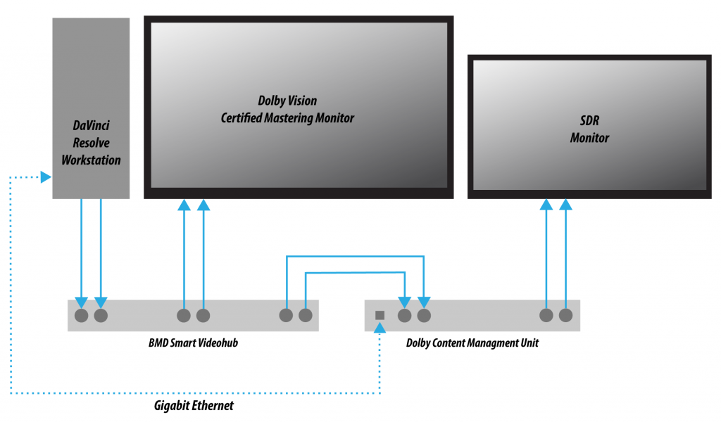
In one possible scenario, you’ll connect your Resolve workstation’s dual SDI outputs to the BMD Smart Videohub, which splits the video signal to two mirrored sets of SDI outputs. One mirrored pair of SDI outputs goes to your HDR display. The other mirrored pair of SDI outputs goes to the CMU (Content Mapping Unit), which is itself connected to your SDR display via SDI. Lastly, the Resolve workstation is connected to the Dolby CMU via Gigabit Ethernet to enable the CMU to communicate back to Resolve.
The CMU is an off-the-shelf video processor that uses a combination of proprietary automatic algorithms and colorist-adjustable metadata within Resolve to define, at least initially, how an HDR-graded video should be transformed into an SDR picture that can be displayed on a standard Rec. 709 display, as well as how the enhancement layer should scale itself to varying peak luminance levels.
Dolby Vision automatic analysis and manual trim controls in DaVinci Resolve send metadata to the CMU that’s encoded into the first line of the SDI output. This metadata guides how the CMU makes this transformation, and the controls for adjusting this metadata are exposed in the Dolby Vision palette. These controls consist of luminance-only Lift/Gamma/Gain controls (that work slightly differently than those found in the Color Wheels palette), Chroma Weight (which darkens parts of the picture to preserve colorfulness that’s clipping in Rec.709), and Chroma Gain.
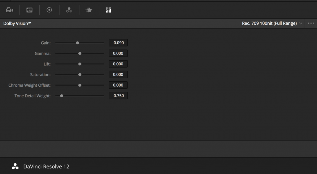
Dolby Vision Palette in the Color page
(Updated) These Dolby Vision analysis and trim controls in DaVinci Resolve send metadata to the CMU by encoding it into the first line of the SDI output. This metadata guides how the CMU makes this transformation, because the CMU is actually the functional equivalent of the Dolby Vision chip that’s inside each Dolby Vision-enabled television, what you’re really doing is using the CMU to make your SDR display simulate a 100 nit Dolby Vision television.
Additionally, the CMU can be used to output 600 nit, 1000 nit, and 2000 nit versions of your program, if you want to see how your master will scale to those peak luminance levels. This, of course, requires the CMU to be connected to a display that’s capable of being set to those peak luminance output levels.
Though not required, you have the option to visually trim your grade at up to four different peak luminance levels, including 100 nit, 600 nit, 1000 nits and 2000 nit reference points, so you can optimize a program’s visuals for the peak luminance and color volume performance of many different televisions with a much finer degree of control. If you take this extra step, Dolby Vision compatible televisions will use the artistic guidance metadata you generate in each trim pass to ensure the creative intent is preserved as closely as possible, in an attempt to provide the viewer with the best possible representation of the director’s intent.
For example, if a program were graded relative to a 4000 nit display, along with a single 100 nit Rec 709 trim pass, then a Dolby Vision compatible television with 750 nit peak output will reference the 100 nit trim pass artistic guidance metadata in order to come up with the best way of “splitting the difference” to output the signal correctly. On the other hand, were the colorist to do three trim passes, the first at 100 nits, a second at 600 nits, and a third at 1000 nits, then a 750 nit-capable Dolby Vision television would be able to use the 600 and 1000 nit artistic intent metadata to output more accurate HDR-strength highlights that take better advantage of the 750 nit output of that television.
You should note that to expose the Dolby Vision controls in DaVinci Resolve Studio, you need a Dolby Vision Mastering license from Dolby. More instructions for all of this are available in the DaVinci Resolve User Manual.
Dolby Vision Certified Mastering Monitors
At the time of this writing, only three displays have been certified as Dolby Vision Certified Mastering Monitors. Requirements include a minimum peak brightness of 1000 nits, a 200,000:1 contrast ratio, P3 color gamut, and native support for SMPTE ST.2084 as the EOTF (otherwise known as PQ). When grading Dolby Vision, your monitor should be set to a P3 gamut using a D65 white point. Suitable displays include:
- The Sony BVM X 300 (30″, 1000 nit peak luminance, 4K)
- The Dolby PRM 32FHD (32″, 2000 nit peak luminance, 1080)
- The Dolby Pulsar (42″, 4000 nit, 1080)
Of these, only the Sony is commercially available. The Dolby monitors are not commercially available, and are provided only in limited availability from Dolby.
Setting Up Resolve Color Management For Grading HDR
Once the hardware is set up, setting up Resolve itself to output HDR for Dolby Vision mastering is easy using Resolve Color Management (RCM). In fact, this procedure is pretty much the same no matter which HDR mastering technology you’re using. Only specific Output Color Space settings will differ.
Set Color Science to DaVinci YRGB Color Managed in the Master Project Settings, and Option-click the Save button to apply the change without closing the Project Settings. Then, open the Color Management panel, and set the Output Color Space pop-up to the HDR ST.2084 setting that corresponds to the peak luminance, in nits, of the grading display you’re using. For example, if you’re grading with a Sony BVM X300, choose HDR ST.2084 1000 nits. At the time of this writing, RCM supports six HDR ST.2084 peak luminance settings:
- HDR ST.2084 300 nits
- HDR ST.2084 500 nits
- HDR ST.2084 800 nits
- HDR ST.2084 1000 nits
- HDR ST.2084 2000 nits
- HDR ST.2084 4000 nits
This setting is only the EOTF (a gamma transform, if you will). If “Use Separate Color Space and Gamma” is turned off, the Timeline Color Space setting will define your output gamut. If “Use Separate Color Space and Gamma” is turned on, then you can specify whatever gamut you want in the left Output Color Space pop-up menu, and choose the EOTF from the right pop-up menu.
Be aware that whichever HDR setting you choose will impose a hard clip at the maximum nit value supported by that setting. This is to prevent accidentally overdriving HDR displays, which can possibly have negative consequences depending on which display you happen to be using.
Next, choose a setting in the Timeline Color Space that corresponds to the gamut you want to use for grading, and that will be output. For example, if you want to grade the timeline as a log-encoded signal and “normalize” it yourself, you can choose Arri Log C or Cineon Film Log. If you would rather have Resolve normalize the timeline to P3-D65 and grade that way, you could choose that setting as well.
Be aware that, when it’s being properly output, HDR ST.2084 signals appear to be very log-like, in order to pack their wide dynamic range into the bandwidth of a standard video signal. It’s the HDR display itself that “normalizes” this log-encoded image to look as it should. For this reason, the image you see in your Color page Viewer is going to appear flat and log-like, even though the image being displayed on your HDR reference display looks vivid and correct. If you want to make the image in the Color Page Viewer look “normalized” at the expense of clipping the HDR highlights, you can use the 3D Color Viewer Lookup Table setting in the Color Management panel of the Project Settings to assign the appropriate “HDR X nits to Gamma 2.4 LUT,” with X being the peak nit level of the HDR display you’re using.
Additionally, the “Timeline resolution” and “Pixel aspect ratio” (in the project settings) that your project is set to use is saved to the Dolby Vision metadata, so make sure your project is set to the final Timeline resolution and PAR before you begin grading.
Resolve Grading Workflow For Dolby Vision
Once the hardware and software is all set up, you’re ready to begin grading Dolby Vision HDR. The general workflow in DaVinci Resolve is fairly straightforward.
- First, grade the HDR image on your Dolby Vision Certified Mastering Monitor to look as you want it to. Dolby recommends starting by setting the look of the HDR image first, to determine the overall intention for your grade.
- When using various grading controls in the Color page to grade HDR images, you may find it useful to enable the HDR Mode of the node you’re working on by right-clicking that node in the Node Editor and choosing HDR mode from the contextual menu. This setting adapts that node’s controls to work within an expanded HDR range. Practically speaking, this makes controls that operate by letting you make adjustments at different tonal ranges, such as Custom Curves, Soft Clip, etcetera, work over an expanded range, which makes adjusting wide-latitude images being output to HDR much easier.
- When you’re happy with the HDR grade, click the Analysis button in the Dolby Vision palette. This analyzes every pixel of every frame of the current shot, and performs and stores a statistical analysis that is sent to the CMU to guide its automatic conversion of the HDR signal to an SDR signal.
- If you’re not happy with the automatic conversion, use the Lift/Gamma/Gain/Chroma Weight/Chroma Gain controls in the Dolby Vision palette to manually “trim” the result to the best possible Rec.709 approximation of the HDR grade you created in step 1. This stores what Dolby refers to as “artistic guidance” metadata.
- (Updated) If you obtain a good result, then move on to the next shot and continue work. If you cannot obtain a good result, and worry that you may have gone too far with your HDR grade to derive an acceptable SDR downconvert, you can always trim the HDR grade a bit, and then re-trim the SDR grade to try and achieve a better downconversion. Dolby recommends that if you make significant changes to the HDR master, particularly if you modify the blacks or the peak highlights, you should re-analyze the scene. However, if you only make small changes, then reanalyzing is not strictly required.
As you can see, the general idea promoted by Dolby is that a colorist will focus on grading the HDR picture relative to the 1000, 2000, 4000, or higher nit display that is being used, and will then rely on the colorist to use the DolbyVision controls to “trim” this into a 100 nit SDR version, with this artistic guidance turned into metadata and saved for each shot. This “artistic guidance” metadata is saved into the mastered media, and it’s used to more intelligently scale the HDR highlights to fit within any given HDR display’s peak highlights, to handle how to downconvert the image for SDR displays, and also to determine how to respond when a television’s ABL circuit kicks in. In all of these cases, the colorist’s artistic intent is used to guide all dynamic adjustments to the content, so that the resulting picture looks as it should.
Analyzing HDR Signals Using Scopes
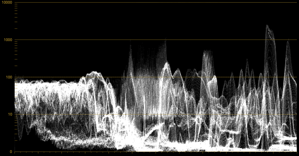
When you’re using waveform scopes of any kind, including parade and overlay scopes, the signal will fit within the 10-bit full-range numeric scale much differently owing to the way HDR is encoded. The following chart of values will make it easier to understand what you’re seeing:
- 1023 = 10,000 nits (no known display)
- 920 = 4000 nits (peak luminance on a Dolby Pulsar Monitor)
- 844 = 2000 nits (peak luminance on a Dolby PRM 32FHD)
- 767 = 1000 nits (peak luminance on a Sony BVM X300)
- 528 = 108 nits (Dolby Cinema projector peak luminance)
- 519 = 100 nits
- 0 = 0 nits (black, ideally corresponds to less than 0.05 nits on LCD, 0.0005 nits on OLED)
If you’re monitoring with the built-in video scopes in DaVinci Resolve Studio, you can turn on the “Enable HDR Scopes for ST.2084” checkbox in the Color panel of the Project Settings, which will replace the 10-bit scale of the video scopes with a scale based on “nit” values (or cd/m²) instead.
If you’re unsatisfied with the amount of detail you’re seeing in the 0 – 519 range (0 – 100 nits) of the video scope graphs, then you can use the 3D Scopes Lookup Table setting in the Color Management panel of the Project Settings to assign the appropriate “HDR X nits to Gamma 2.4 LUT,” with X being the peak nit level of the HDR display you’re using. This converts the way the scopes are drawn so that the 0 – 100 nit range of the signal takes up the entire range of the scopes, from 0 through 1023. This will push the HDR-strength highlights up past the top of the visible area of the scopes, making them invisible, but it will make it easier to see detail in the midtones of the image.
Rendering a Dolby Vision Master
To deliver a Dolby Vision master after you’ve finished grading, you want make sure that the Output Color Space of the Color Management panel of the Project Settings is set to the appropriate HDR ST.2084 setting, based on the peak luminance in nits of your HDR display. Then, you want to set your render up to use one of the following Format/Codec combinations:
- TIFF, RGB 16-bit
- EXR, RBG-half (no compression)
(Updated) When you render for tapeless delivery, the artistic intent metadata is rendered into an Dolby Vision XML and delivered with either the Tiffs or EXR renders. These two sets of files are then delivered to a facility that’s capable of creating the Dolby Vision Mezzanine File (this cannot be done in Resolve).
Playing Dolby Vision at Home
On distribution, televisions that have licensed Dolby Vision use the base layer and enhancement layer+metadata to determine how the HDR image should be rendered given each display’s particular peak luminance capabilities. Distributors, for their part, need to provide a minimum 10-bit signal to accommodate Dolby Vision’s wide range. As a result, Dolby Vision videos will look as they should on displays from 100 nits through however many nits the program was mastered to take advantage of, up to 10,000 nits, with the enhancement layer’s HDR-strength highlights being scaled to whatever peak luminance level is possible on a given display using the artistic intent metadata as a guide, and recombining these highlights with the base layer, so that there’s no unpredictable clipping, and the image looks as it should.
SMPTE ST.2084, Ultra HD Premium, and HDR10
Some display manufacturers who have no interest in licensing Dolby Vision for inclusion in their televisions are instead going with the simpler method of engineering their displays to be compatible with SMPTE ST.2084. It requires only a single stream for distribution, there are no licensing fees, no special hardware is required to master for it (other than an HDR mastering display such as the Sony X300), and there’s no special metadata to write or deal with (at this time).
Interestingly, SMPTE ST.2084 ratifies the “PQ” EOTF that was developed by Dolby and that’s used by Dolby Vision that accommodates displays capable of peak luminance up to 10,000 cd/m2 into a general standard. This standard requires at minimum a 10-bit signal for distribution, and the EOTF is described such that the video signal utilizes the available code values of a 10-bit signal as efficiently as possible, while allowing for such a wide range of luminance in the image.
SMPTE ST.2084 is also part of the new “Ultra HD Premium” television manufacturer specification, that stipulates televisions bearing the Ultra HD Premium logo have the following capabilities:
- A minimum UHD resolution of 3840 x 2160
- A minimum gamut of 90% of P3
- A minimum dynamic range of either 0.05 nits black to 1000 nits peak luminance (to accommodate LCD displays), or 0.0005 nits black to 540 nits peak luminance (to accommodate OLED displays)
- Compatibility with SMPTE ST.2084
Finally, ST.2084 has been included in the HDR10 distribution specification adopted by the Blu-ray Disc Association (BDA) that covers Ultra HD Blu-ray. HDR10 stipulates that Ultra HD Blu-ray discs have the following characteristics:
- UHD resolution of 3840 x 2160
- Up to the Rec.2020 gamut
- SMPTE ST.2084
- Mastered with a peak luminance of 1000 nits
The downside is that, by itself, this EOTF is not backwards compatible with SDR displays that use BT.1886 (although the emerging metadata standard SMPTE ST.2086 seeks to address this). Furthermore, no provision is made to scale the above-100 nit portion of the image to accommodate different displays with differing peak luminance levels. For example, let’s say you grade and master an image to have peak highlights of 4000 nits, as seen in the following image:
An image with 4000 nit peak luminance highlights
Then, you play that signal on an ST.2084-compatible television that’s only capable of 800 nits. The result will be that all peaks of the signal above 800 nits will be clipped, while everything below 800 nits will look exactly as it should relative to your grade, as seen in the following image:
The same image clipped to 800 nit peak luminance highlights
This is because ST.2084 is referenced to absolute luminance. If you grade an HDR image referencing a 1000 nit peak luminance display as is recommended by HDR10, then any display using ST.2084 will respect and reproduce all levels from the HDR signal that it’s capable of reproducing as you graded them, up to the maximum peak luminance level it can output. For example, the Vizio R Series television can output 800 nits, so all mastered levels from 801 – 1000 will be clipped.
How much of a problem this is really depends on how you choose to grade your HDR-strength highlights. If you’re only raising the most extreme peak highlights to maximum HDR-strength levels, then it’s entirely possible that the audience might not notice that the display is only outputting 800 nits worth of signal and clipping any image details from 801 – 1000 nits because there weren’t that many details above 800 anyway other than glints and sparks. Or, if you’re grading large explosions filled with fiery detail up above 800 nits in their entirety because it looks cool, then maybe the audience will notice. The bottom line is, when you’re grading for displays that simply display ST.2084, you need to think about these sorts of things.
Monitoring and Grading to ST.2084 in DaVinci Resolve
Monitoring an ST.2084 image is as simple as getting a ST.2084-compatible HDR display (such as the Sony X300), and connecting the output of your video interface to the input of the display. In the case of the Sony X300, which is a 4K capable display, you can connect four SDI outputs from a DeckLink 4K Extreme 12G with the optional DeckLink 4K Extreme 12G Quad SDI daughtercard, or an UltraStudio 4K Extreme, directly from your grading workstation to the X300, and you’re ready to go.
Setting up Resolve Color Management to grade for ST.2084 is identical to setting up to grade for Dolby Vision. You’ll also monitor the video scopes identically, and output a master identically, given that both standards rely upon the same EOTF, and require the same high bit depth.
Hybrid Log-Gamma (HLG)
The BBC and NHK jointly developed a different EOTF that presents another method of encoding HDR video, referred to as Hybrid Log-Gamma (HLG). The goal of HLG was to develop a method of mastering HDR video that would support a range of displays of different brightness without additional metadata, that could be broadcast via a single stream of data, that would fit into a 10-bit signal, and that would be easily backward-compatible with SDR televisions without requiring a separate grade.
The basic idea is that the HLG EOTF functions very similarly to BT.1886 from 0 to 0.6 of the signal (with a typical 0 – 1 numeric range), while 0.6 to 1.0 segues into logarithmic encoding for the highlights. This means that, if you just send an HDR Hybrid Log-Gamma signal to an SDR display, you’d be able to see much of the image identically to the way it would appear on an HDR display, and the highlights would be compressed to present what ought to be an acceptable amount of detail for SDR broadcast.
On a Hybrid Log-Gamma compatible HDR display, however, the highlights of the image (not the BT.1886-like bottom portion of the signal, just the highlights) would be stretched back up, relative to whatever peak luminance level a given HDR television is capable of outputting, to return the image to its true HDR glory. This is different from the HDR10 method of distribution described previously, in which the graded signal is referenced to absolute luminance levels dictated by ST.2084, with levels higher than a TV can output being clipped. With HLG, all HDR-strength highlights will be scaled relative to whatever a television is capable of.
And while this facility to support multiple HDR displays with differing peak luminance levels seeks to accomplish the same goal of scaling HDR-strength highlights to suit whatever a given television is capable of outputting, HLG requires no additional metadata to guide how the highlights are scaled. Depending on your point of view, this is either a benefit (less work), or a deficiency (no artistic guidance to make sure the highlights are being scaled in the best possible way).
As is true for most things, you don’t get something for nothing. The BBC White Paper WHP 309 states that, for a 2000 nit HDR display with a black level of 0.01 nits, up to 17.6 stops of dynamic range without visible quantization artifacts (“banding”) is possible. BBC White Paper WHP 286 states that the proposed HLG EOTF should support displays up to about 5000 nits. So, partially, the backwards compatibility that HLG makes possible is due to discarding long-term support for 10,000 nit displays. However, given that the brightest commercially-available HDR display at the time of this writing is only 1000 nits peak luminance (the Sony X300), and the brightest HDR display I’m aware of only outputs 4000 nits peak luminance (the experimental Dolby Pulsar), it’s an open question whether or not over 5000 nits is necessary for consumer enjoyment. Only time will tell.
At the time of this writing, Sony and Canon have demonstrated displays capable of outputting HLG encoded video. DaVinci Resolve, naturally, supports this standard through Resolve Color Management (the RCM setting is labeled HLG).
Monitoring and Grading to Hybrid Log-Gamma in DaVinci Resolve
Monitoring an HLG image is as simple as getting a Hybrid Log-Gamma-compatible HDR display, and connecting the output of your video interface to the input of the display.
Setting up Resolve Color Management to grade for HLG is identical to setting up to grade for Dolby Vision, except that there are two basic settings that are available:
- HDR HLG-2020
- HDR HLG-709
Optionally, if you choose to enable “Use Separate Color Space and Gamma,” you can choose either Rec.2020 or Rec.709 as your gamut, and HLG as your EOTF.
The Aesthetics of Shooting and Grading HDR
At the moment, given that we’re in the earliest days of HDR grading and distribution, there are no hard rules when it comes to how to use HDR. The sky’s the limit, which makes it either an exciting or harrowing time to be a colorist, depending on your point of view. For me, it’s exciting, and I’ve been telling everyone that grading HDR is the most fun I’ve had as a colorist since I started doing this crazy job.
Developing the HDR image to best effect is, in my view, the domain of the colorist. The importance of lighting well and shooting a wide-lattitude format is indisputable, but the process of actively deciding which highlights of the image are diffuse white, which qualify as HDR-strength, and how bright to make each “plane” of HDR-strength highlights are all artistic decisions and assignments that are most easily and specifically controllable in the grading suite. In this way, I think HDR is going to bind the creative partnership between DPs and Colorists even more tightly.
In this section, I deliberately veer away from the technical in order to explore the creative potential for HDR. Some of this section is based on my experiences, some on my observations of the work of others, but much is also based on my perennial quest to mine the fine arts that have come before us for creative solutions that already exist, but have been neglected due to colorists having been stuck within the narrow confines of BT.709 and BT.1886 for so long. Breaking free of those restraints makes the work of other artistic disciplines even more accessible to us as models for what is artistically possible.
Differentiating Highlights
With images governed by BT.1886, the difference between diffuse and specular highlights can often be as little as 10% of the signal, sometimes less, and these differences are often so subtle as to be lost on most viewers. The difference between highlights of varying intensity can be accentuated by reducing the average levels of your midtones and shadows to create more headroom for differentiated highlights, but then you’re potentially fighting the legibility of the picture in uncertain viewing conditions (read – shitty televisions that are calibrated poorly). Bottom line, with SDR signals, you’re in a position where often both the white shine on someone’s face and a naked light bulb may both be up around 100 nits, which in truth has never really made any sense.
This no longer need be true in an HDR grade, where it’s possible to have skin shine around 100 nits if you want, but you can then push the light bulb up higher in the grade, where it would really peak, maybe at 800 nits. In addition, there will be much more detail available within that light bulb (depending on the latitude of the recording format), so you’ll potentially be able to see the interior of the bulb’s housing, so that the bulb isn’t simply a flat white flare.
Going farther, in an outdoor scene, it’s possible have a bright white t-shirt at one level, colorful highlights on a face at a clearly differentiated level, the rim-lighting of the sun on clouds at a different, higher level, and reflected sun glints off of a lake in the distance at an even higher level, resulting in a much richer distribution of highlight tonality throughout the scene. This is what’s new about grading HDR, you’ve finally got the ability to create dramatically differentiated planes of highlights, which finally gives the digital colorist the perceptual tools that fine artists working in the medium of painting have had for hundreds of years.
To use the example of a painting I referenced in a blog article some time back, Johann Liss’ The Prodigal Son With the Prostitutes, 1623 (Image thanks to TimSpfd at flickr).

Given the elevated black levels of the photograph as seen on this computer screen, it’s hard to grok the true impact of the way this painting looks in person with more ideal gallery lighting and the direct reflection of light off the surface of the painting providing brighter levels than can be reproduced in a photograph. In person, the dimmer highlights of the background players emerge from the inky pools of shadow surrounding everyone, and the highlights of those background players faces are clearly dimmer than the highlights reflected off of the central two characters, and those highlights themselves are at a slightly but noticeably reduced level from the brilliant whites of the foreground sleeves and metallic glints dappled here and there throughout the image.
This, to me, represents the promise of what HDR grading done creatively can offer, in terms of using multiple planes of differentiated highlights to create a sensual glimmer, to add exciting punch to the image, and to guide the eye on a prioritized tour around the scene; to the arm encircling the woman’s waist, to the hand splashing wine into the prodigal’s gobblet, to the Prodigal’s face lasciviously eyeing the activities before him.
Getting Used to It
One thing that multiple colorists warned me about, and that I definitely experienced, is that it takes a little time to get used to “the look of HDR.” When you’ve spent years getting to know how audiences respond to images with a BT.1886 distribution of tonal values that max out at 100 nits, how to see and allocate highlights within that narrow range of tonality, and how images “should” look when graded for broadcast, the shockingly brilliant highlights and color volume that HDR allows can be confusing at first. It doesn’t look “right.” It shouldn’t even work.
More to the point, it’s tempting to either avoid highlights that seem too bright altogether, or to succumb to the impulse to linearly scale the entire image, midtones and all, to be uniformly brighter. Both impulses are ones you should try to avoid, but to avoid them, you’re going to need some time to get used to seeing what HDR images have to offer. To get used to the idea of comparatively subdued shadows and midtones contrasted against brilliant splashes of color and contrast. To familiarize yourself with tones and colors on an expanded palette that you’ve never had the opportunity to play with before. In conversation, colorist Shane Ruggieri was emphatic about the need to “unlearn 709 thinking” in order to be able to more fully explore the possibilities that HDR presents.
Don’t Just Turn It to Eleven
It cannot be over-emphasized that HDR grading is not about making everything brighter. Never minding the limitations imposed by the ABL on consumer televisions, just making everything brighter is like doing a music mix where you simply make everything louder. You’re not really taking advantage of the ability to emphasize specific musical details via increased dynamic range, you’re just making individual details harder to hear amongst all the increased energy bombarding the audience. Maintaining contrast is the key to taking the best advantage of HDR-strength highlights, which will lack punch if you boost all of your midtones too much and neglect the importance and depth of your shadows. HDR images only really look like HDR images when you’re judicious with your highlights.
I honestly think that looking to various eras of painting can be enormously instructive when getting ideas for what to do with HDR. I was in the middle of this article when I happened to go to an event at the Minneapolis Institute of Art. Since I had HDR on the brain as I wandered the collection, a few pieces leapt out at me as terrific examples of the use of selective specular highlights, large shadow areas combined with pools of highlights, and the guidance of the viewer’s eye through an entire scene within a single frame using lighting. Clearly, the reproductions I include in this article are a poor facsimile compared to seeing these paintings in person, where the reflective light from the surface of the painting results in a considerably more vivid experience, but I’ve tried to simulate their punch by applying a simple, slight gamma correction to give you a similar impression to what I felt when viewing the originals. Of course, your computer screen’s accuracy is the limiting factor.
A Little Can Go a Long Way
The following painting (Nicolas Poussin’s The Death of Germanicus, 1627) is a great example of using targeted high-octane highlights to great effect. Notice how the vast majority of the image is relatively dark, employing rich colors in the low midtones and high shadows (which can also be reproduced due to the increased color volume of HDR displays) but the artist uses polished strokes of brightness in key areas to add specular highlights that make the image really pop. These highlights are few, small, and they’re carefully targeted, but they punch up an image that otherwise has relatively subdued highlights falling on the skin and cloth of the participants. Also, because of the lattitude available to HDR-strength highlights, specular shines such as these can fall off gracefully towards the shadows, so that they’re not harsh “cigarette burns” with an abrupt edge, but areas that transition smoothly and naturalistically out of the lower tones of the image.
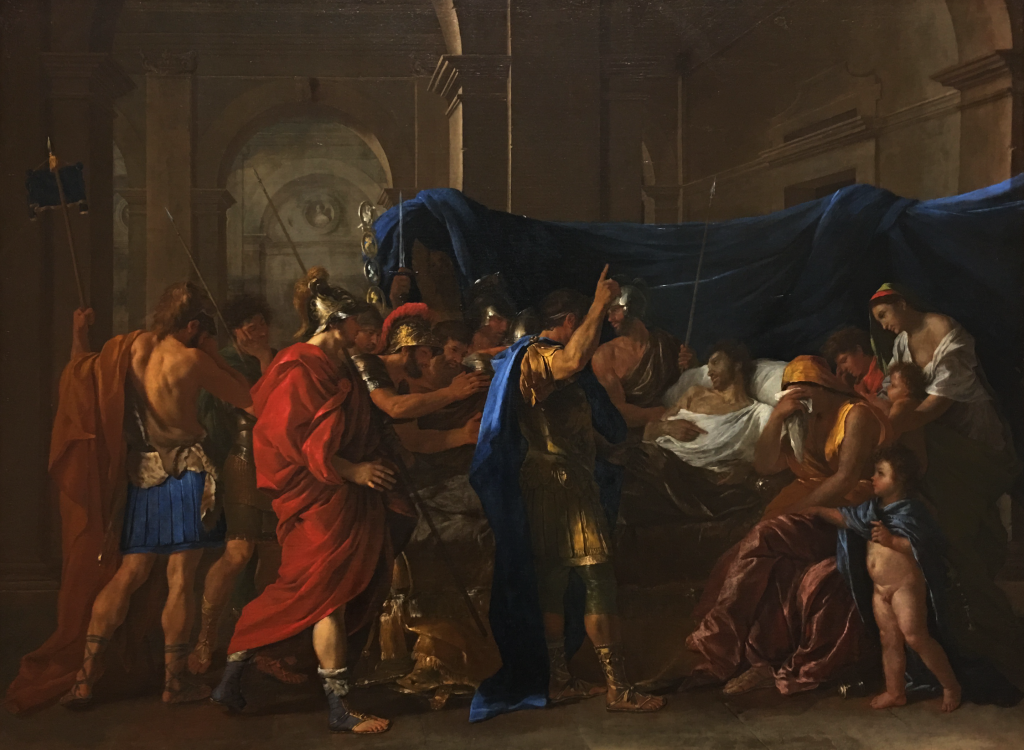
Nicolas Poussin’s The Death of Germanicus, 1627
This, to me, is a tremendous illustration of what HDR enables the colorist to now do. In another example (Cornelis Jacobz. Delff’s Allegory of the Four Elements, c. 1600), a still life with metal vessels is brought vividly to life through the use of some carefully placed metallic shine, despite a preponderance of shadows wrapped around every surface. These bright highlights are streaked here and there through the image, adding an impression of considerable sharpness thanks to the resulting contrast.
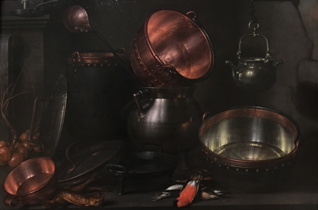
Cornelis Jacobz. Delff’s Allegory of the Four Elements, c. 1600
Know When to Fold It
Granted, it’s easy to overdo HDR-strength highlights. On one job I was grading, one of the characters of a scene had brass buttons on their jacket, which were natural candidates for putting out some HDR-strength glints. I keyed and boosted them, but I was moving so fast that the first adjustment I made had the buttons glowing like little suns. I paused to take in the effect, and the client and I simultaneously burst out laughing, the result was so completely ridiculous. It goes without saying that HDR-strength highlights should be motivated, but I was surprised by just how instantly hilarious the wrong use of these highlights was.
Balancing Subjects in the Frame, Using Negative Space
Keeping the people inhabiting a scene interesting despite amazing HDR effects happening in the background also becomes a new and interesting challenge. In an SDR image, even the brightest highlights in an image may only be 25 nits higher than the highlights coming off of people, so subjects aren’t so easily overwhelmed by their surroundings. However, in HDR you might have vividly colorful 600 nit highlights in the background that are competing with 100 nit highlights illuminating people inhabiting the foreground. One example that springs to mind from a program I saw graded by another colorist was a scene with sun-drenched stained-glass windows placed behind two actors having a conversation. After the first preliminary primary adjustment which went by the natural lighting in the scene, the window was so beautifully spectacular that the people in front held practically zero interest. A bit of extra work was required to pull the actors out back in front so they could compete with the scenery.
A useful example can be seen in the following painting (Constant Troyon’s Landscape with Cattle and Sheep, c. 1852-58), where the white cow catches the sunlight in dazzling fashion, relative to the far dimmer tones found throughout the rest of the image. The milk-maid is almost easy to miss, were she not so forcefully present as negative space within the cow’s dazzling highlights.
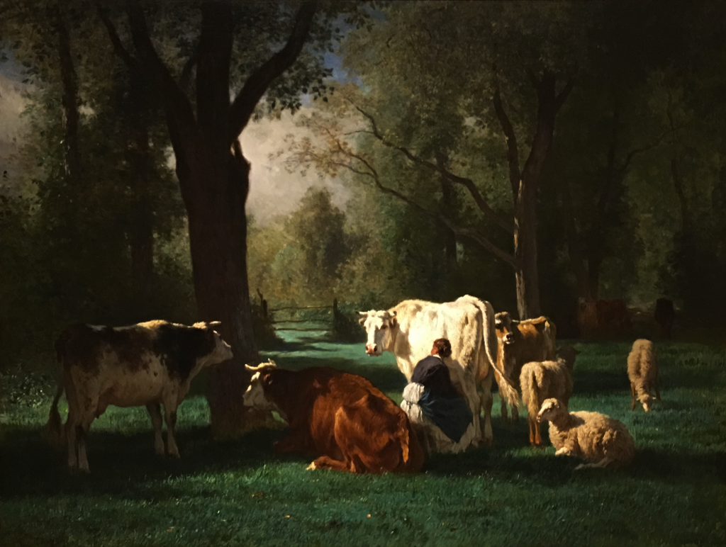
Constant Troyon’s Landscape with Cattle and Sheep, c. 1852-58
A creative use of negative space in the composition of an image can be a powerful way out of this dilemma, which is nice as this is a technique the colorist can harness through careful control of contrasting midtone and shadow values.
Plan for a Wandering Eye
I’ve heard several people express concern about HDR-strength highlights proving distracting, but I think it’s a mistake to be too terrified of losing the audience’s attention to the bold highlights that are possible within an HDR image. In the following image (Giovanni Francesco Barbieri’s Ermina and the Shepherds, 1648-49), the most vivid planes of highlights are on the armored woman’s arm, face, breastplate, and robes, on the man’s sleeve, elbow, and knee, and on the arm of the foremost boy to the right, and the sheep. The man’s face is hilighted, but diminished relative to these other elements, as are (to a greater extent) the faces of the two boys far to the back. However, this lighting scheme adds considerable depth to the image, as the brighter elements jump forward, pushing the darker elements back. And the artist uses contrast of saturation to make sure that the ruddy faces of the boys are still worthy of the viewer’s attention vs. their immediate background. The highlights don’t necessarily drive our gaze directly to each face as the first thing we look at, but the path traced by our eyes moving among each available highlight gets us there nonetheless, as a secondary act of exploration.
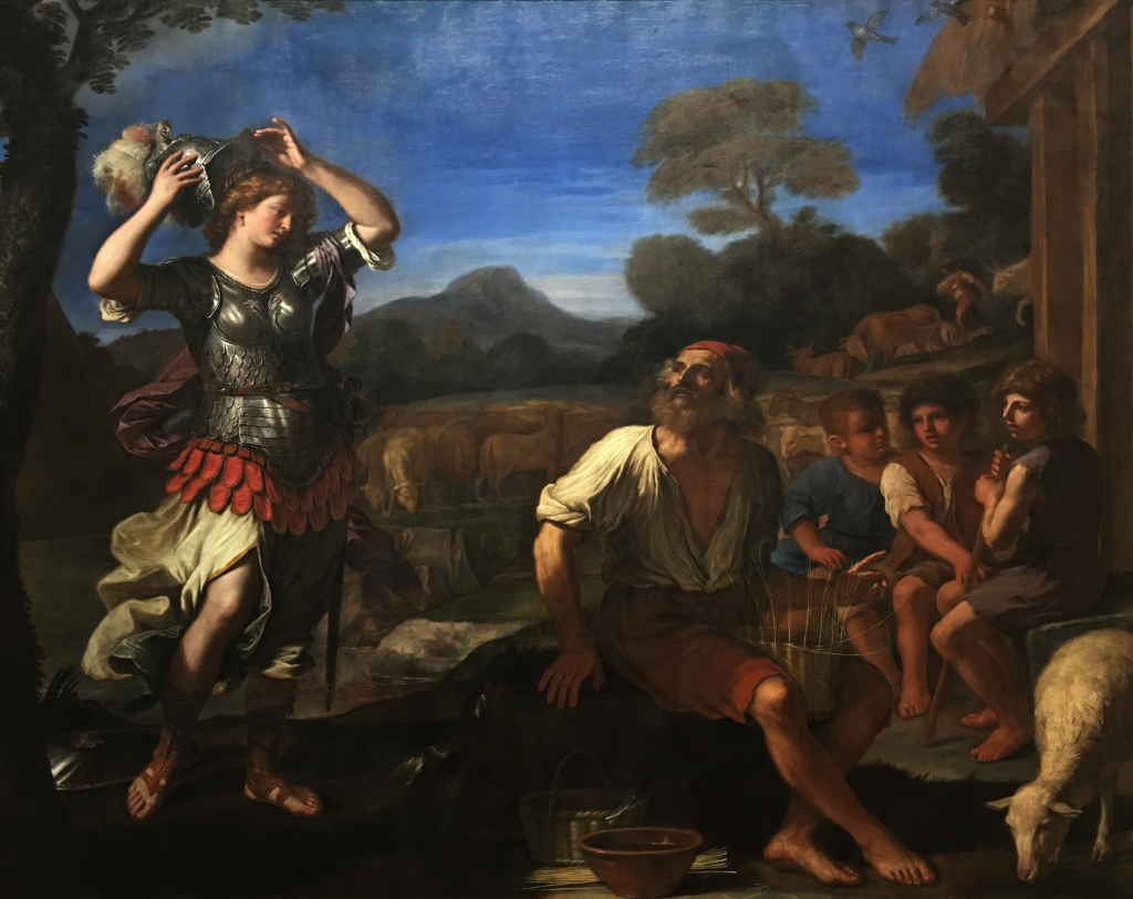
Giovanni Francesco Barbieri’s Ermina and the Shepherds, 1648-49
Something I’m keen to try more of as I work with a greater range of HDR programming is the potential for directing the viewer’s gaze by sprinkling HDR highlights strategically across the image. I think we’ve become a bit too obsessed with treating the colorist’s ability to guide the eye using digital relighting and vignetting as a “bulls-eye” targeting technique, giving the viewer only a single clear region of the image to focus on. I suspect that to utilize HDR most effectively, we need to reconsider the notion of guiding the viewer’s eye through the scene, providing a path from one part of the image to another that encourages the viewer to explore the frame, rather than simply having the viewer obsess over just one element within it. In this way, HDR-strength highlights can be used to provide a roadmap through the image.
In this regard, fine artists showed the way hundreds of years ago. I’ve long felt that painted scenes were once the equivalent of an entire short film in terms of the viewer’s experience, and the technique of being guided through an ambitious work’s mise-en-scène by the painter via lighting is an amazing thing to experience in person, if you’re willing to give the time. In the following image (Francesco Bassano; Jacopo Bassano’s The Element of Water, c. 1576-1577), dappled highlights pluck each of the scene’s participants from the shadows to spectacular effect, and guide the viewer’s eye along the thoroughfare of the scene’s major areas of activity, not just through the street, but farther down the road, to the horizon in the distance.
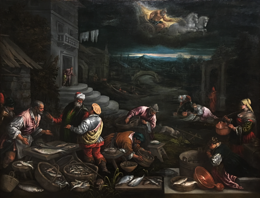
Francesco Bassano; Jacopo Bassano’s The Element of Water, c. 1576-1577
With the wider and now-standard 16:9 frame available to the home viewer and the considerably wider availability of large-screen televisions from 55-85 inches, the medium is ripe for creating a more ambitious mise-en-scène that challenges the viewer to engage more fully with the narrative image. And even on smaller devices, the so-called “retinal” resolutions now available to the tablet and “phablet” viewer make it possible to peer more deeply into even these diminutive images. So, instead of using grading as an invitation to the viewer to dwell on a single element of the picture, it might be time to compose, light, and grade in such a way as to invite a more sweeping gaze, guided in part by HDR-strength highlights.
Choices For Handling Midtones
So yes, HDR provides endless opportunities for finding creative uses for your highlights. Blah, blah, blah. However, in an HDR grade, what are we to do with our midtones? This is an interesting question that is, in my opinion, ripe for exploration.
The first answer is the “party line” that many discussions of HDR emphasize (myself as well), which is to grade your midtones (including skin tones which fall squarely within the midtones of most images) largely the same as you would before. Not only does this make it easier to create dazzling HDR effects in contrast to restrained midtones and deep shadows, but this makes it considerably easier to maintain backward compatibility with the Rec.709 trim pass that you’re inevitably going to have to produce, given that the vast majority of televisions out in the world are still SDR. At this point in time, grading to make your trim pass easier makes all the sense in the world.
However, I don’t think it’s going to take very long for colorists to begin seeing the potential of using the lower portion of whatever range of HDR highlights you’re mastering with to let the brighter midtones of an image breathe, so long as you can count on a few hundred nits more peak luminance to maintain the separation and punch of your HDR-strength highlights. Of course, if you’re grading relative to a lower peak luminance threshold, then you should probably keep your high midtones lower, otherwise you risk de-emphasizing the glittery effect that’s possible.
However, assuming you’ve got the headroom, an example of what should be possible when allowing oneself to use the brightness and saturation that can be found within the 100-400 nit midtone range might be seen in the following painting (Gerrit van Honthorst’s The Denial of St. Peter, c. 1623). This painting employs a beautiful use of silhouettes and vignetting shadows as negative space against the vividly lit face at the center of the image. Pushing these skin tone highlights up past what’s ordinarily possible in SDR to achieve more luminosity through the combination of brightness and saturation would make this practically jump off the screen, while maintaining an even more profound separation from the shadows, shadows that nonetheless hold considerable detail because it’s not necessary to crush them to flat black in order to maintain contrast given the higher midtones. In such an image, 800 nit highlights wouldn’t even be necessary, though you’d probably find a few pixels of eye glints, metal on the candlestick, or (as in the painting) shine off of the top edge of the foreground soldier’s breastplate, to provide just a tiny bit of flash up around 700-1000 nits.
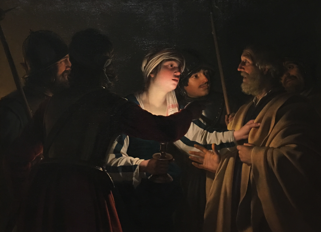
Gerrit van Honthorst’s The Denial of St. Peter, c. 1623
If you let yourself use higher-nit midtones, you’ll have more of a chore before you as you trim those grades to look as they should on a BT.709/BT.1886 display, but I anticipate as more and more of the viewing audience upgrades to HDR-capable televisions, it’ll be worth it.
Contrast of Saturation Becomes Even More Powerful
Truly, all forms of color contrast will become more potent tools for the colorist given the increased color volume that a P3 or Rec.2020 gamut coupled with BT.2084 or HLG permits. Different hues have the potential to brilliantly ring against one another at the higher levels of saturation that will be allowed. However, the availability of richer saturation also means that you can have multiple planes even of the same hue of blue, for instance, all differentiated from one another by significantly different levels of saturation.
Should I Worry About the Audience’s Eyeballs?
It’s good to be mindful that, should someone at home eventually have a 2000 nit television, that sun in the frame that you decided to put all the way up at the top of your grade will definitely make them squint. I’m not kidding, I graded a sun all the way to peak luminance in the shot on a 2000 nit Dolby display, and everyone in the room was squinting. However, I’m not too personally worried. I’ve had long HDR grading sessions with 1000 nit displays, and while I was initially worried about early eye fatigue, in truth I had not that much more eye fatigue at the end of an 8-hour day than I do with SDR grading sessions. That said, I’m pretty firm about taking regular breaks every 2-3 hours from the grading suite to stretch the legs, get a tasty beverage, and see the sun for a few minutes before diving back into the job, so perhaps my good habits help.
However, spectacularly vivid contrast is something that regularly occurs in our everyday lives. For example, while chatting with Shane, he shared some actual luminance measurements from his office, in which shadowed areas of the wall with visible image detail fell around 1.5 nits, and light reflected from just under a fluorescent fixture measured 3070 nits, making the point that examples from life can inform and reestablish what dynamic range can plausibly be within a scene, even one as subdued as a “dimly lit office.”
Dolby’s “The Art of Better Pixels” document, authored by D.G. Brooks of Dolby Laboratories (available here), cites tests performed to determine preferred viewer experiences for black, diffuse white, and highlight levels. Studies with viewers show that on large-screen displays, diffuse white values around 3,000 nits and peak highlights at 7,000 nits were luminance levels that satisfied 90% of the test subjects (smaller screens engendered even higher preferred levels). I suspect any colorist who’s had a client ask for “more contrast, more contrast, still more contrast” can certainly relate to this data.
I also see the ability to have these sorts of squint-inducing highlights as another creative opportunity, one that’s been available to audiences looking up at the stage lighting of plays, musicals, and concerts for years. If you’re careful not to abuse the privilege, I think the ability to cut to a bright frame, surprise with a sudden flare or shower of sparks, or grade a light-show with similar physiological impact to the real thing can create compelling narrative opportunities in our storytelling.
HDR In Movie Restoration
I’ve seen several examples of older films being remastered for HDR, which I find an interesting task for consideration. In truth, when remastering older films, you’re adding something that wasn’t there. Even during a film’s original theatrical run, the standard for peak luminance in the theater has long been only 48 nits (SMPTE 196M specified 16 fL open gate with a minimum of 11 fL, practically 14 – 9 fL with light running through a strip of clear film), although with a gamma of 2.6 and a lack of surround lighting, that peak luminance seems much brighter than it actually is.
Bottom line, a television displaying HDR-strength highlights at even 500 nits is going to present isolated highlights that are vastly brighter than this (at least when viewed in a darkened room). If you’re interested in preserving the director’s intent, then splashing HDR onto older films is a case of deliberately imposing something new onto an older set of decisions.
On the other hand, for directors and cinematographers who are revisiting their own films, older negatives have ample latitude to be re-scanned and regraded to take advantage of HDR, to present a new look at previously released material.
While this article is largely focused on HDR for television, it’s also worth mentioning that there are emerging theatrical exhibition formats for HDR, such as Dolby Cinema, which allows the projection of images with peak luminance of 108 nits, over double the brightness of ordinary theatrical projection, advertising down to 0 nit black for a claimed 1 million to 1 contrast ratio on Dolby Cinema projectors (a collaboration between Dolby and Christie). This high contrast in a darkened theater yields similarly dazzling results when graded carefully, and I believe many of the creative decisions I describe here will apply to cinema grading as well.
Being Creative During the Shoot
I think HDR really shines when contemplating the creation of new films and television, where you have the opportunity to think about how to use HDR as a deliberate part of the project.
Despite my assertion that HDR will thrive as a domain of colorist creativity, cinematographers obviously have real decisions to make. I suspect that more careful and deliberate lighting schemes will mean more lighting and grip used to shape the pools and ratios of light and shadow. From my experience, it’ll really help colorists save time if you create the preconditions for the sparkly bits that you want, so we don’t have to go digging around the highlights around the signal to find something specific to pry out. It’ll be interesting to see more deliberate planning for a differentiation between diffuse whites and HDR-strength highlights, in order to take advantage of the fact that there’s a difference between 100 nit, 400 nit, and 800 nit highlights.
Additionally, the art department has an enormous contribution to make, as production designers, set dressers, wardrobe, and makeup all have something to add to (or subtract from) the HDR image. Production Designers will be tasked with making sure there are highlights to be had through careful selection of set materials, paint, and glossy vs. flat regions of the environment. Small set dressing and propmaster decisions will have a large impact – selection of items within the frame such as having a couple of shiny desk accessories in the office (or not), using a car with chrome trimming, using reflective fabrics, etcetera, etcetera.
Wardrobe choices offer similar opportunities. Sequins, brass buttons, shimmery or flat fabrics, choice and manner of stitching, selection of wardrobe accessories, all these and more are opportunities to contribute to what HDR can present to the audience. Even the makeup artists can contribute. It only takes a few pixels of highlights adjacent a few pixels of lower midtones to create some HDR-strength flash, so cosmetics with shimmer or gloss, glitter, or simple control of shine become powerful tools to shape HDR effects on arguably the most important subject within any frame, people’s faces.
All these are tremendously meaningful decisions when shooting for HDR mastering, and the prudent creative team would do well to schedule more on-camera testing with a colorist’s support to see how things are going to work out. This is exactly what I’m contemplating doing for my next film, more on-camera testing prior to the actual shoot to see how different makeup and costume schemes are going to work. It’s a bit more logistics than the typical indie project has to go through, but I think it’ll be worth the hassle. I’ll let you know when it’s done.
If Grading In DaVinci Resolve, What Tools Will Help?
At the end of the day, grading HDR material is simply a matter of manipulating a video signal with a different weight to the distribution of shadows, midtones, and however many levels of highlights you’ll be individuating. Just as a quick tip, here are some Resolve tools that I’ve found help enormously when grading HDR material:
- Resolve 12.5 has a new HDR Mode in the Node Editor, which has become indispensable for HDR grading when you’re outputting to one of the HDR or HLG profiles using Resolve Color Management (RCM). Right-click any node and turn on HDR Mode to set the controls in that node to act upon a wider signal range than normal, and you’ll find that the controls in the Color Wheels palette, the Custom Curve controls, and soft clip all feel much more natural than they do when HDR Mode is turned off (which is the default).
- The Highlights control, found in page 2 of the Color Wheels palette, can be a fast way of boosting or attenuating highlights while simultaneously adjusting the high midtones of the image. This control works better with HDR Mode enabled.
- Using the Highlight master control in the Log mode of the Color Wheels palette is a more targeted way of boosting or attenuating the highlights of your image. Using the default High Range parameter setting and HDR Mode enabled, this control affects only the top HDR-strength highlights of the image. With HDR Mode disabled, this control affects more of the highlights of the image, but is more restrictive than the Highlights control. You can of course change how much of the top end of the signal is affected by adjusting the High Range parameter.
- Custom Curves, with HDR Mode enabled, are hugely useful when shaping the contrast of the HDR highlights, the midtones, and the shadows. In fact, I can safely say that every HDR grade I’ve done has used the Custom Curves to create just the right tonal separation for each situation.
- Secondary corrections made by Luma Keying or Chroma Keying just the range of highlights that I want to boost or attenuate is an invaluable technique that I’ve used again and again. Often, I may want to isolate highlights that aren’t actually the brightest thing in the picture to boost up to become HDR-strength highlights, because the natural highlights of the image (light falling on someone’s face, for example), weren’t good candidates for HDR-strength highlights.
In Conclusion
Due in part to my unbridled enthusiasm for the topic, and the fact that HDR is such a wide-ranging subject, what I had intended to be a quick overview of HDR gradually snowballed into a massive 14,000 word essay on the topic. At the time of its writing, there’s a lively debate about which formats will “win” the hearts and minds of audiences and the industry, whether or not people are ready for HDR-strength brightness, what the correct (and by extension incorrect) uses of HDR should be, and ultimately, whether HDR is worth the hassle.
Clearly, I think it is.
That said, this is a rapidly evolving facet of the industry, and I’ll be curious to find out how long it takes for this article to become woefully out of date and in need of an upgrade. Usually I just write an article here and leave it for the ages, but this one I’ll have to keep an eye on. I hope you’ve found it useful.
26 comments
Excellent timely summary. Much needed. There’s so much confusion about HDR, and it’s only going to get worse.
[…] http://vanhurkman.com/wordpress/?p=3548 […]
Excellent and inspiring thoughts on the use of negative space, saturation contrast and highlight control through this much useful tool termed HDR.
[…] http://vanhurkman.com/wordpress/?p=3548 […]
Thank you!
Wow Great Article, thanks.
Terrific article sir, with one small clarification: the implementation of Dolby Vision on UHD Blu-ray involves a HDR10 base layer and the DV enhancement layer, there is no specific SDR layer that can be creamed off. But it’s not all bad news for SDR, as the implentation of dynamic content-derived metadata should ensure that the SDR grade is just as well served.
Wow!. Impressive!. The most detailed article about HDR that I have found as today. I share it with everyone, it´s a MUST to know this to know how works HDR and how to get it right!.
Thanks!
What raw decode settings should you use in a RCM workflow. I though raw data was mapped direct in RCM but it appears the RED and cinemaDNG decode settings get applied as well. I found decoding using camera meta data appears to work the best.
The red decode settings have options for req2020 and 2087 but the cinema DNG doesn’t. Its a bit confusing that the decode gamma can interfere with the RCM gamma. A CinemaDNS mapping gamma of 2.4 causes clipping that can’t be recovered where as the use camera meta on the same clip preserves the highlights.
Also in timeline mode do you recommend using the 2087 gamma instead of the 2087 500 and applying 2087 500 only to the output?
If your tv can peak to like 630 nits do you still recommend using 2087 500 or should I go up to 2087 800?
If I use 2087 500 as my output should I drop my tv’s brightness to peak at 500? As another level of complexity the manual says a video level of 668 should = 540 nits which great than 500. Should I master to 540 then instead of 500?
I’ll take this one at a time. Regarding the RED settings, you might want to double-check that you have DaVinci YRGB Color Managed enabled, because on my system (latest build) enabling color management still only maps R3D clips one way. You can change the Project settings, but it doesn’t change how the data is being decoded. Regarding the color management settings, I usually set the Timeline Color Space to Rec 709 and Gamma 2.4, unless I’m doing something special. The correct Output Color Space setting depends on what you’re doing. If you’re grading for delivery, you’ll usually have a spec you need to adhere to (such as 1000 nits) and typically one will have a display capable of meeting that spec, so that’s what you set the Output to. However, if you’re just grading to what your particular display can accomplish, you can just choose whatever nit level is just under your TV’s max. Keep in mind that this setting is simply a hard clip at that level to prevent displays that don’t do well when being fed an overdriven signal from going bananas. If your TV doesn’t freak out with an overdriven signal, there’s no reason to choose an Output Color Space setting that underperforms your television. And this is where I give all the standard disclaimers about being careful about using consumer displays in professional environments, careful calibration, adherence to standards, blah blah blah.
Fantastic article; I learned a lot about how colour grading is done in general as well as for HDR. It also confirmed my suspicions about some HDR content being simply SDR turned up to 11. (As a consumer I’m sometimes scrabbling around on YouTube for things to watch so it’s not surprising to find the occasional bad job.)
Further to that, I wonder if you might have anything to say from a consumer point of view. As an example of the kinds of thing I am thinking about, one question is: what does a good HDR colour grading job look like? I want to see something that you think has been done well so I can calibrate my expectations, and start to be able to tell when, for example, the artistic intent is to show me something extreme and garish or very dark or very bright, and when that’s just the result of something going wrong somewhere in the chain from DP’s brain to my eyes. If people are moaning about Star Trek being too dark, what is wrong?
Another aspect is how can I become a better consumer? A properly calibrated TV is a minimum, of course, but what about room lighting considerations. Even 48 nits looks bright in a dark movie theatre, and Dolby Cinema’s 108 nits must look very bright. But even a new OLED TV reaches 600+ nits so properly calibrated should it still be ideally viewed in a pitch black room? Or 10% of the peak level of the TV as I have seen suggested? To what extent does it even matter?
I’m not really asking for a consumer level guide to HDR, but rather how you as colourist think about how real people are really viewing content and how you wish they would.
Most home entertainment content is graded to be viewed in a “dimly lit” living room. On the consumer side of things, I wouldn’t want to overburden viewers with a lot of requirements that nobody will bother following, save for perhaps (a) try not to have any light sources reflecting off the front of the TV, (b) try to have the ambient light of your viewing environment somewhat subdued, and (c) try to have your TV set to whatever “cinema” mode gives you a 6500K white point and 24p without motion interpolation. In general, self-illuminated displays like LCD and OLED are not actually meant to be viewed in pitch black conditions. LCD in particular benefits from a bit of ambient lighting to make the black level seem darker than it really is. Overall, viewing a self-illuminated display in the dark will exaggerate the highlights beyond what they’re really meant to look like, colorists themselves work with a “bias light” behind the hero display to make sure they’re not working in pitch black conditions. So there you have it.
With regards to what a “proper” HDR grade is supposed to look like, this technology is so new, we’re all trying to figure out what that means, still. It’s like asking “what’s a painting supposed to look like?” I’m hoping that the answer will be that many different colorists, DPs, and filmmakers will try using HDR in different ways, for different effects. It’s a new medium, it deserves to be played with and experimented upon.
What a stunning article, Mr Van Hurkman! An absolute joy to read.
Technically impressive and illuminating (pun gracefully accepted), yet boldly sensuous and creative, showing a clear appreciation for the aesthetics of the visual. In short – spectacularly beautiful.
Your article delves so deeply, so completely into the subject of HDR, using wonderful classical artwork, that it reaches beyond the surface into metaphysical appreciation. The very heart of the subject.
It’s one of those classic pieces of literature that evoke the imagination, conjure images in the mind and make you dream, which is a marvellous achievement for a topic that is also very technical.
From someone who shares your appreciation of cinema, I thank you wholeheartedly for the care and dedication you have shown.
Thank you!
Given dolby cinema is peaking at just above SDR peak nits, it begs the question, is Dolby Cinema “truly” HDR??
Peaks are essentially getting clipped at 100nits, so I fear this is just marketing hype. It should be noted that the new IMAX laser projectors can achieve similar nits in SDR, and subjectively the picture when compared to dolby Cinema “HDR” is just as (if not more) impressive.
My thinking is that the HDR effect is relative to the previous nit levels that were available. Since cinema peak white levels were so low to begin with, and we’re used to diffuse white (in a black box environment) appearing correctly at 48 nits, doubling that to 106 nits (Dolby Cinema), if you grade it correctly, will certainly give you highlights that pop in relation to the rest of the image. However, the other advantage of the newer projectors is deeper blacks than previous projection has been capable of, which push the contrast that’s apparent to our eyes even higher. For this reason, I think this generation of projection can plausibly be called HDR in truly blackout viewing conditions, even though the peak white levels are considerably less than those of an HDR television (which is likely not going to be watched in blackout conditions). However, whenever newer generations of projectors become available that deliver even brighter peaks, I have no doubt those will be marked as “more” HDR than before.
Thanks for your earlier reply to me, Alexis. It’s interesting that your suggestions are all things I am already doing through reading around and also experimentation, notably having the room dim but not completely dark, which seems most comfortable.
Now there is a lot more HDR content to look at, I’m finding that different colorists do seem to use it in different ways. Sometimes it is very subtle, other times a shot will look dramatically stunning. And today I received my first Dolby Vision Bluray disc. Fun times!
That’s been something I’ve been trying to communicate to folks, that there’s no one way of treating HDR-strength highlights. How much and when to use are entirely an artistic decision, and something that should ideally be discussed between the director and the cinematographer.
[…] more about HDR, I would encourage you to check out these contrary blog posts by Stu Maschwitz and Alexis Van Hurkman. I tend to side with Stu’s point-of-view and am not a big fan of […]
Excellent article…Alexis!
Freakyguy666, yes, the Dolby Cinema peaks at 108nits. However, peaks are not what makes it “High Dynamic Range”. The contrast (from darkest black to brightest white) in typical cinema today is about 2000:1 (on a good day and on a new bulb). The contrast in the Barco (2800:1) and IMAX laser projectors I deliver are at best 8000:1. The Dolby Cinema laser projectors are 1,000,000:1. So the Dynamic Range of a Dolby Cinema is massive and therefore, yes, definitely the upper end of High Dynamic Range.
I’ve work on HDR imagery since 2010 and on systems up to 30,000nits. HDR is not just Brightness..to me, it’s more about the massive Range, from dark to bright, in which we can now move our images “through”, lesser-know and publicized temporal aspects that bring in new experiences such as adaptation, which is your eye’s steady state of dynamic range adjusting to accommodate
the new range of light entering your eye – iris open and closing. This and other coming experiences engage psychophysical interactions that have not been experienced yet by the average consumer given that the consumer devices are only hitting 800nits. One example: I can show you fire at 4000nits and your skin involuntarily flushes.
HDR is in its infancy, however, as more consumer TV’s achieve the upper end of the ST-2084’s 10,000nit definition, you will begin to have experiences never before had from content on TV or at the Cinema (Sony just showed a 10,000nit TV at CES!).
Fantastic article, thank you Alexis !
I have a question , if you ay have the time to reply. I shot a documentary film for French TV which is now going to be also bought by NHK. They are asking if we shot HDR. Knowing that all cameras are HDR capable, I find this odd. However, my camera was a Sony FS7 and it was set to record in XAVC-I in SLog. Do you know if this codec and curve will allow for an HDR mastering ? Thanks in advance.
Jean Marc.
I realize I’m hideously late in replying (it’s been a busy year) but the important thing is that your shooting format be at least 10- or 12-bit, as the additional bit depth is necessary to be able to stretch your signal across the range that HDR requires. I don’t know what options the FS7 has, but that’s what you need to check.
Wonderful review, congratulations and many thanks.
Question: is it possible grading in HDR (SMPTE ST.2084 or HDR10, with an HDR TV) simply using a Decklink Mini Monitor 4K (instead of Extreme model)?
Thanks
I’m not positive, but looking at the specs it seems like you ought to, as it supports 10 and 12 bit RGB 444 at 1080p resolution, or 10-bit 422 YUV in up to DCI 4K.
In regards to working in DaVinci YRGB vs. DaVinci Colour Managed. If grading and exporting in HDR (Rec2020/ST2084), can you grade in DaVinci YRGB and apply an Open FX Colour Space Transformation on node one and still achieve the same look and information as DaVinci Colour Managed if it were set to the same Colour Space and Gamut? What’s the difference?
Sorry for the late reply, been a busy year and my blog’s been in need of repairs. To answer your question, the Color Space Transform should give you identical results to Color Management being enabled for the project overall, it’s simply a matter of workflow how you do it. Sometimes I do one, sometimes the other, depending on the mix of formats in a project and on how detailed I’m being on the job. Using the Color Space Transform lets you customize your transform settings on a per-clip basis within your grade, so in some situations you can get a better result working this way. However, if your material is all consistently shot, then using overall color management is usually just fine.