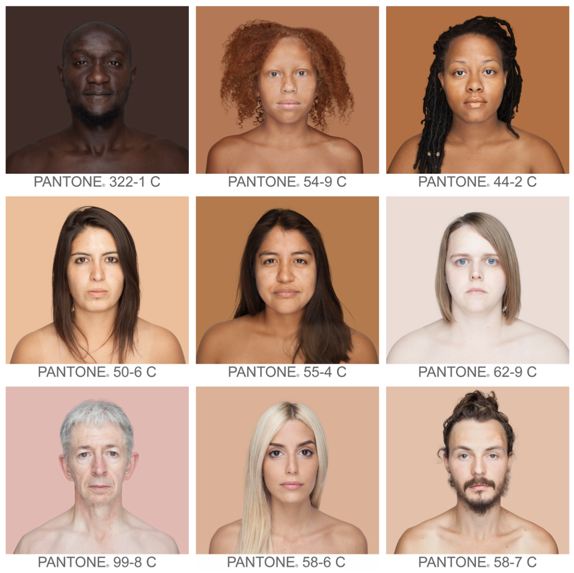
I originally stumbled upon this thanks to i09 back in 2012, and just had to share it. In the process of updating my web site, I checked up on the project again and saw that I need to make several updates, because of anything the information has become even more relevant. The Humanae Project, originally on Tumblr but now moved to a new home at angelicadass.com, is Brazilian artist Angelica Dass’ ongoing effort to sample the skin tone of as wide a variety of people as possible, matching an average sampled value from each to a corresponding Pantone swatch. It’s deceptively simple, brilliant work.
Angelica’s work takes on a poignant urgency in today’s strained political climate, that sees baldfaced racists with public platforms across the world continue to attempt to justify absurd discriminatory attitudes and practices based, in the end, on skin hue and lightness. She presents her project beautifully in a 2016 TED talk, which I encourage you to watch.
From my perspective as a colorist, her work also represents an ambitious effort to chart the range of possibilities of that most memorable of memory colors, the hue and tone of human skin. This is an effort I tackled in a small way (with the help of photographer Sasha Nialla) in my Color Correction Handbook. My original collated samples were meant merely to illustrate that the hue of the skin tones of all people on earth actually fall within a very specific cloud on the vectorscope’s color wheel; not a line representing a single hue, but a cloud of related hues, at different levels of saturation. Learning to perceive and retain these fine variations between the hues of different complexions, even while making image adjustments to correct for lighting and other issues, is a critical skill of the colorist. My goal was to encourage colorists to avoid grading all skin tones to be the same, which is a very real danger posed by inexperience.
The photographic samples I offered in the Handbook had a very small sample size; the much larger sample size of this project makes the survey incredibly compelling. In a Google translation from the original Spanish, the About page of the original post shared the following:
The development of the project is conducting a series of portraits whose background is dyed the exact shade extracted from a sample of 11×11 pixels the very face of the people portrayed. The ultimate aim is to record and catalog, through a scientific measurement, all possible human skin tones.
In the TED talk of 2016, Angelica mentions that the color sample is chosen from the nose, which is an interesting choice given the variation in hue and lightness most people have in different areas owing to different amounts of sun received, but it’s a good way of eliminating the problem of highlights and shadows in ambient lighting (this is something that came up in my simple illustrations in the book). Because of this variation, a single Pantone representation doesn’t strike me as all that useful to the colorist in terms of representing any one person’s skin tone with any fidelity. However, the aggregate of all of these sampled patches is incredibly interesting when seen as data points on a scatter graph that could illustrate a cloud of possibility, where human skin hue and lightness are concerned.
This is a fantastic project, and I look forward to seeing the sample size continue to grow and expand to illustrate more and more of the subtle hues that can be found in humanity. Bravo.
For more information, see humane.org, the web site of the Humanae Institute.

4 comments
Hi Alex,
I hope this email finds you well.
We spoke briefly @ your Davinci 9 demo in NYC and had spoken before via phone because of our mutual connection to Twitch Post.
Just reaching out to say thanks for all your insights and sharing of knowledge. Also to ask what your latest thoughts are on Resolve 9? Worth jumping into soon as it arrives? Or wait a bit for the bugs to shake out.? (My normal M.O.) I’m asking because I’m mainly round-tripping from Avid (5.5.3) where I work. And while it works reasonably well, I was wondering if there’s any marked improvement. I thought you might know or have some Beta experience with it. If you can spare a moment, please let me know.
I hope your projects are coming to fruition with sanity.
Be well,
Dario
Well, as I’m working with the development team, there’s not a whole lot I feel comfortable saying about Resolve 9 until it’s released. It is possibly safe for me to say that I’ve really been enjoying the Resolve 9 workflow, and I think folks are going to find the new UI is a significantly improved experience. Other then that, you’ll have to wait until the release for me to get into specifics.
And don’t worry, I will. 😉
You being involved in the development gives me hope as well as your positive experience. I know Avid sometimes doesn’t play well with others (including their own Pro Tools software!) but considering FCP “screwed the pooch” with X and Post Houses I’m hoping for even better Avid round-tripping and workflow. I’ll hang back & keep an eye out for the reviews. Better safe than sorry, especially on the clients dime.
I think I can safely say that folks will find the AAF story in Resolve 9 much improved, and I put quite a bit of time into documenting the overall workflow, from Avid to Resolve and back again.